Image to HTML converter

IMG2HTML turns a JPG, PNG or WebP of a web page, an app screen or even a paper sketch into a single HTML file styled with Tailwind CSS. The layout, the text, the colors and the icons are rebuilt as code you can edit, not pasted in as an image.

  • Real text, headings, buttons and lists, in the order they appear in the image.
  • Tailwind classes for spacing and color, Font Awesome for icons, placeholders for photos.
  • An editor to change things by prompt and export to React, Vue or Angular.

Each conversion uses one credit. The smallest plan is a 3-credit trial; see pricing.

Free and instant, no account: extract the text of a picture into a basic HTML file. Runs in your browser with OCR; it does not rebuild the layout.

Free text-only picture to HTML

Before and after: four real conversions

Each image below was sent to IMG2HTML on 23 September 2026 and the HTML it returned was opened in Chrome without touching a line. The screenshot is a real capture of upload-post.com, a sister product of ours; the wireframe photo, the app mockup and the design frame were created with an image model for this page. Next to each result: what came out right and what you would still fix by hand.

A photo of a paper wireframe
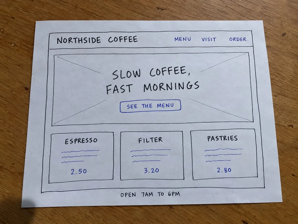
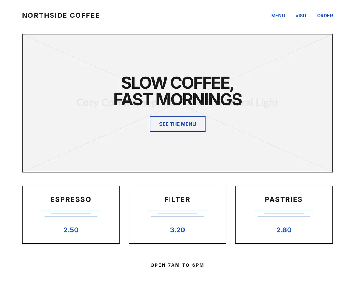
Photo of a hand-drawn wireframe on paper for a coffee shop site called Northside Coffee: navigation, a hero with the headline Slow coffee, fast mornings, three product boxes with prices and a footer with opening hours
Input: Phone photo of a hand-drawn wireframe (JPG, 1536 x 1152)
The generated HTML rendered in a browser: Northside Coffee navigation, a hero box with the headline and a See the menu button, three product cards priced 2.50, 3.20 and 2.80, and the opening hours
Output: the generated HTML rendered in Chrome at 1280px wide, unedited. 124 lines of HTML with Tailwind CSS, returned in 11 seconds.

What it got right

  • Every piece of text from the sketch, in the same order: logo, the three links, headline, button, three product names, prices and the opening hours.
  • The layout: nav bar with a rule under it, a boxed hero, three equal cards in a row and a centred footer line.
  • The two pen colours: black for structure and text, blue for links, the button and prices.

What to fix by hand

  • The crossed box (the usual wireframe sign for an image) became a placehold.co image whose caption text shows faintly behind the headline. Swap it for your real photo.
  • The scribbled lines under each product were turned into thin decorative lines. Replace them with the descriptions you meant to write.
coffee-wireframe.html (first lines of the body)
 <body class="bg-white">
  <!-- Header -->
  <header class="max-w-6xl mx-auto px-4 py-6 flex justify-between items-center border-b-2 border-black mt-4">
   <div class="text-2xl font-bold tracking-widest">
    NORTHSIDE COFFEE
   </div>
   <nav class="space-x-8">
    <a class="text-blue-700 font-semibold tracking-wide hover:underline" href="#">
     MENU
    </a>
    <a class="text-blue-700 font-semibold tracking-wide hover:underline" href="#">
     VISIT
    </a>
    <a class="text-blue-700 font-semibold tracking-wide hover:underline" href="#">
     ORDER
    </a>
   </nav>
  </header>
  <!-- Hero Section -->
  <section class="max-w-6xl mx-auto px-4 mt-6">
   <div class="relative h-[500px] sketch-border flex flex-col items-center justify-center text-center bg-gray-50 overflow-hidden">
    <!-- Placeholder for Hero Image -->
    <img alt="A cozy coffee shop interior with wooden tables and natural light coming through large windows" class="absolute inset-0 w-full h-full object-cover opacity-20" src="https://placehold.co/1200x500?text=Cozy+Coffee+Shop+Interior+with+Natural+Light"/>
    <div class="relative z-10 px-4">
     <h1 class="text-5xl md:text-6xl font-bold tracking-tighter mb-8 uppercase">
      SLOW COFFEE,
Open the full generated page (124 lines)

A screenshot of a live landing page

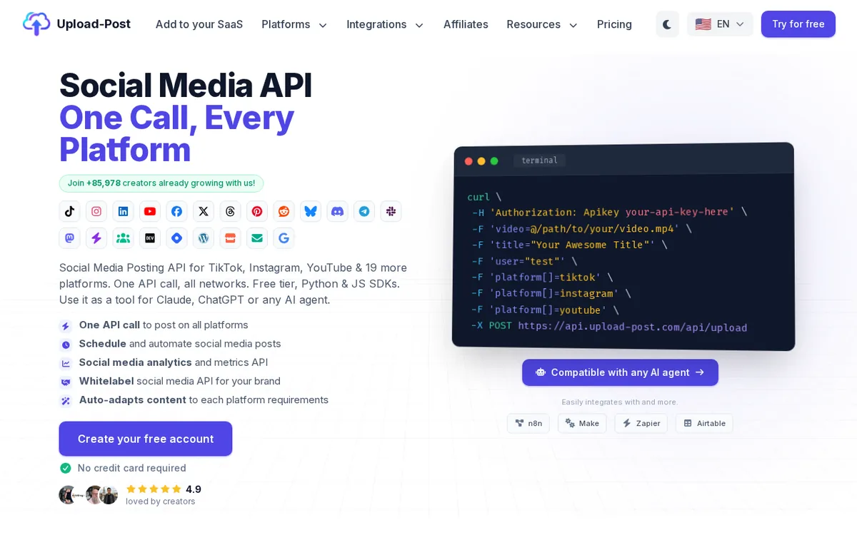
Screenshot of the Upload-Post home page: navigation with dropdowns, the headline Social Media API, One Call, Every Platform, rows of social network icons, a terminal window with a curl command and a Create your free account button
Input: Browser screenshot of upload-post.com (PNG, 1280 x 800)
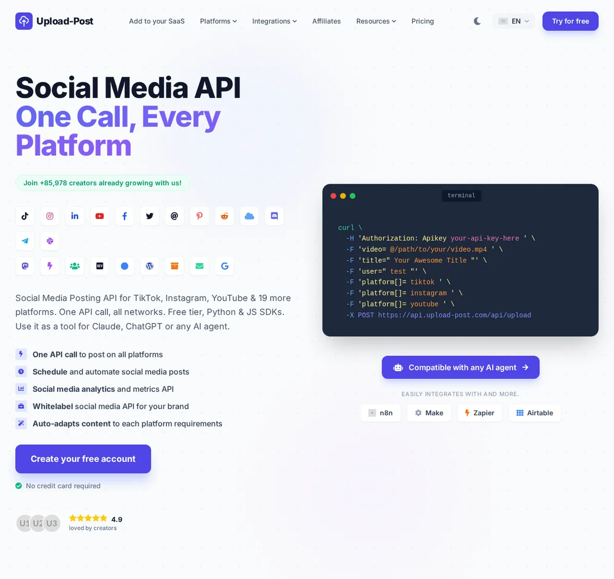
The generated HTML rendered in a browser: the same navigation, two-colour headline, social icons, the terminal with the curl command, feature list, call to action button and integration chips
Output: the generated HTML rendered in Chrome at 1280px wide, unedited. 463 lines of HTML with Tailwind CSS, returned in 27 seconds.

What it got right

  • The navigation, with the dropdown carets, the dark-mode button, the language picker and the Try for free button.
  • The two-colour headline, the green counter badge, the feature list with its small icons and the Create your free account button.
  • The terminal window with all eight lines of the curl command, as real text you can edit, not an image.
  • Recognisable brand icons from Font Awesome for TikTok, Instagram, LinkedIn, YouTube, Facebook, Pinterest, Reddit, Discord, Telegram, Slack, Mastodon, WordPress, DEV and Google.

What to fix by hand

  • Brands that Font Awesome 5 does not have were approximated: X shows the old Twitter bird, Threads an @ sign and Bluesky a cloud. Drop in the official SVGs.
  • The user avatars and the flag became placehold.co placeholders (U1, U2, U3).
  • The icons wrap into three rows instead of two and the hero sits a little lower than in the original, so spacing needs a pass.
upload-post-screenshot.html (first lines of the body)
 <body class="text-slate-900">
  <!-- Navigation -->
  <nav class="max-w-7xl mx-auto px-4 sm:px-6 lg:px-8 py-6 flex items-center justify-between">
   <div class="flex items-center gap-2">
    <div class="bg-indigo-600 p-1.5 rounded-lg">
     <svg class="w-6 h-6 text-white" fill="none" stroke="currentColor" viewbox="0 0 24 24" xmlns="http://www.w3.org/2000/svg">
      <path d="M7 16a4 4 0 01-.88-7.903A5 5 0 1115.9 6L16 6a5 5 0 011 9.9M15 13l-3-3m0 0l-3 3m3-3v12" stroke-linecap="round" stroke-linejoin="round" stroke-width="2">
      </path>
     </svg>
    </div>
    <span class="text-xl font-extrabold tracking-tight">
     Upload-Post
    </span>
   </div>
   <div class="hidden md:flex items-center space-x-8 text-sm font-medium text-slate-600">
    <a class="hover:text-indigo-600" href="#">
     Add to your SaaS
    </a>
    <div class="flex items-center gap-1 cursor-pointer hover:text-indigo-600">
     Platforms
     <i class="fas fa-chevron-down text-[10px]">
     </i>
    </div>
    <div class="flex items-center gap-1 cursor-pointer hover:text-indigo-600">
     Integrations
     <i class="fas fa-chevron-down text-[10px]">
Open the full generated page (463 lines)

A mobile app mockup

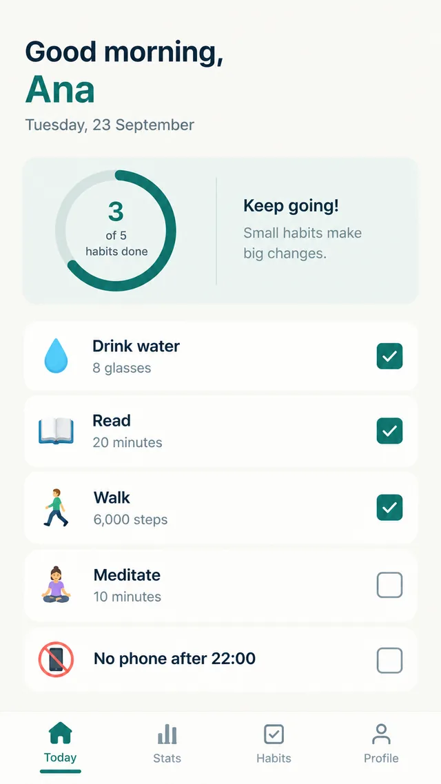
Mockup of a habit tracker app home screen: Good morning, Ana, a progress ring with 3 of 5 habits done, five habit rows with checkboxes and a bottom tab bar with Today, Stats, Habits and Profile
Input: Mobile app screen mockup (PNG, 864 x 1536)
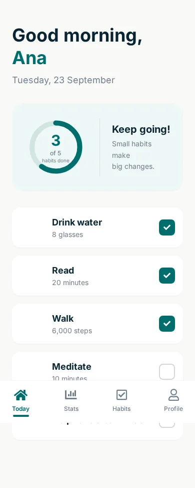
The generated HTML rendered at 390 pixels wide: greeting, progress ring, habit rows with checked and unchecked boxes and a fixed tab bar at the bottom
Output: the generated HTML rendered in Chrome at 390px wide, unedited. 191 lines of HTML with Tailwind CSS, returned in 19 seconds.

What it got right

  • The greeting with the name in the teal accent colour, the date and the rounded summary card.
  • The progress ring, drawn in SVG, filled to match 3 of 5, with the Keep going! message beside it.
  • Five habit rows with the right checked and unchecked states, and a bottom tab bar with Font Awesome icons and the active tab underlined.

What to fix by hand

  • The emoji icons of each habit were written as placehold.co images with the emoji as text; they render as empty squares. Use the emoji directly or your own icons.
  • The tab bar is fixed to the bottom of the screen without padding on the list, so it covers the last habit. Add bottom padding the height of the bar.
habit-app-mockup.html (first lines of the body)
 <body class="text-[#0a2533] min-h-screen flex flex-col">
  <div class="max-w-md mx-auto w-full px-6 pt-12 pb-24 flex-grow">
   <!-- Header -->
   <header class="mb-8">
    <h1 class="text-4xl font-bold leading-tight">
     Good morning,
     <br/>
     <span class="text-[#006d6d]">
      Ana
     </span>
    </h1>
    <p class="text-[#708090] mt-2 text-lg">
     Tuesday, 23 September
    </p>
   </header>
   <!-- Progress Card -->
   <div class="bg-[#eef7f6] rounded-3xl p-6 mb-8 flex items-center">
    <div class="relative flex items-center justify-center w-32 h-32 mr-6">
     <svg class="w-full h-full">
      <circle class="text-[#d1e5e3]" cx="64" cy="64" fill="transparent" r="48" stroke="currentColor" stroke-width="10">
      </circle>
      <circle class="text-[#006d6d] progress-ring__circle" cx="64" cy="64" fill="transparent" r="48" stroke="currentColor" stroke-dasharray="301.59" stroke-dashoffset="120.63" stroke-linecap="round" stroke-width="10">
      </circle>
     </svg>
     <div class="absolute inset-0 flex flex-col items-center justify-center text-center">
      <span class="text-3xl font-bold text-[#006d6d]">
Open the full generated page (191 lines)

A desktop design frame exported as PNG

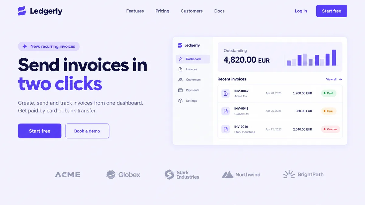
Design frame of a landing page for an invoicing app called Ledgerly: navigation, the headline Send invoices in two clicks, two buttons, and a dashboard card with an outstanding amount, a bar chart and three invoices marked Paid, Due and Overdue, above a row of customer logos
Input: Landing page design frame (PNG, 1536 x 864)
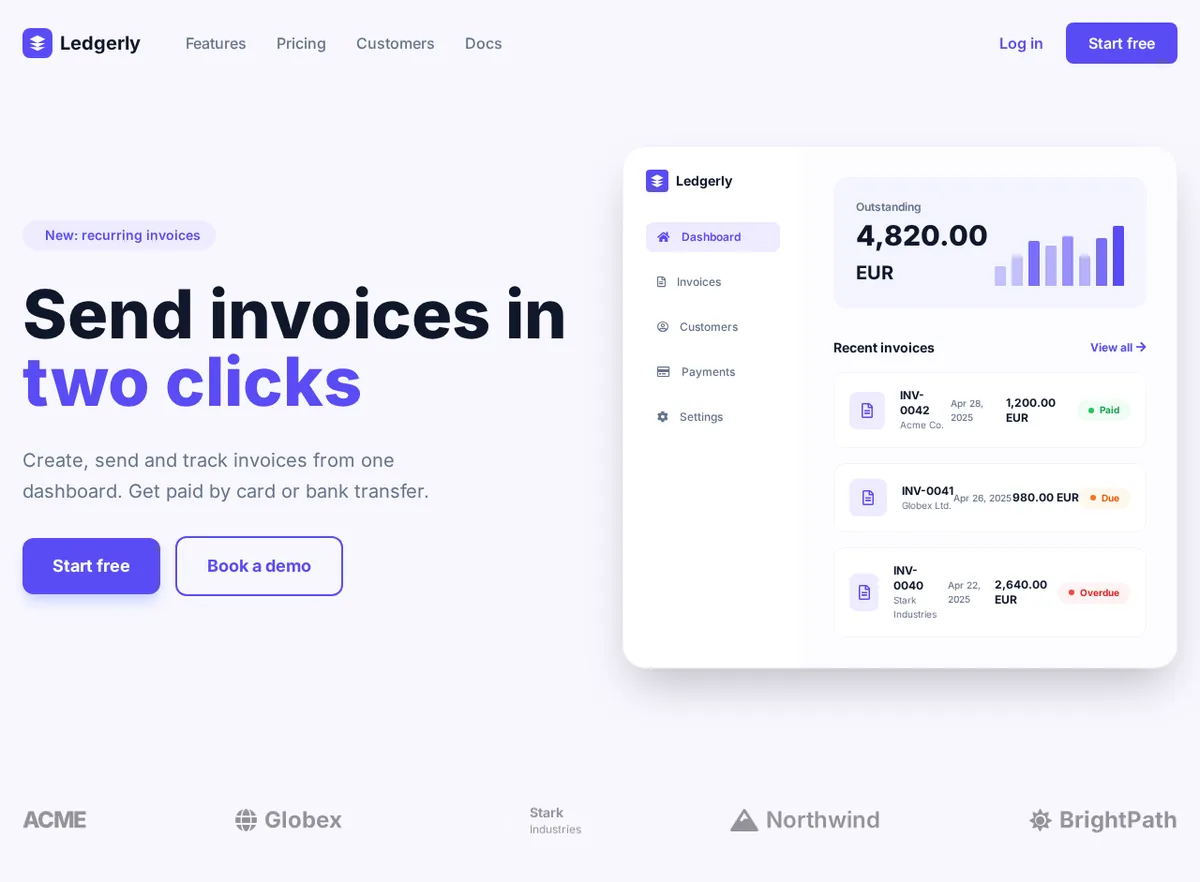
The generated HTML rendered in a browser: navigation, the two-colour headline, Start free and Book a demo buttons, the dashboard card with sidebar, bar chart and invoice list with coloured status badges, and the customer logo row
Output: the generated HTML rendered in Chrome at 1280px wide, unedited. 320 lines of HTML with Tailwind CSS, returned in 23 seconds.

What it got right

  • The whole hero: pill label, two-colour headline, paragraph and the filled and outlined buttons, in the violet of the design.
  • The dashboard card as real HTML: sidebar menu with the active item, the outstanding amount, a bar chart built from divs, and three invoice rows with Paid, Due and Overdue badges in green, orange and red.
  • The customer logo row, with every name as text.

What to fix by hand

  • Logos are stand-ins: the Ledgerly mark is a generic stacked-layers SVG, Globex and Northwind use Font Awesome icons, and the Stark Industries tile uses a bg-dark class the page never defines, so it is invisible. Replace them with your SVGs.
  • The sparkle icon in the pill label is fa-sparkles, which the Font Awesome 5 free set does not include, so it renders as nothing.
  • At 1280 pixels the invoice rows are tight and INV-0042 wraps onto two lines. Give the right column more room or shorten the date column.
ledgerly-frame.html (first lines of the body)
 <body class="min-h-screen">
  <!-- Navigation -->
  <nav class="max-w-7xl mx-auto px-6 py-6 flex items-center justify-between">
   <div class="flex items-center space-x-12">
    <div class="flex items-center space-x-2">
     <div class="w-8 h-8 bg-primary rounded-lg flex items-center justify-center">
      <svg class="w-5 h-5" fill="white" viewbox="0 0 24 24">
       <path d="M12 2L2 7l10 5 10-5-10-5zM2 17l10 5 10-5M2 12l10 5 10-5">
       </path>
      </svg>
     </div>
     <span class="text-xl font-bold text-dark">
      Ledgerly
     </span>
    </div>
    <div class="hidden md:flex space-x-8 text-muted font-medium">
     <a class="hover:text-primary transition" href="#">
      Features
     </a>
     <a class="hover:text-primary transition" href="#">
      Pricing
     </a>
     <a class="hover:text-primary transition" href="#">
      Customers
     </a>
     <a class="hover:text-primary transition" href="#">
Open the full generated page (320 lines)

How to convert an image to HTML

  1. Pick the image. A screenshot at its natural size works best. Crop out browser bars and anything that is not part of the design; the model rebuilds everything it sees.
  2. Upload it and convert. The first version arrives in 10 to 30 seconds and opens in the editor, with a live preview of the page.
  3. Adjust by prompt or by hand. Ask for changes in plain words ("make the header sticky", "use a dark background") or edit the code directly, then switch the output to inline CSS, React, Vue or Angular if Tailwind is not what your project uses.
  4. Replace the placeholders. Photos, logos and brand icons come back as placeholders with a description of what was there. Swap in your own files and you are done.

What converts well, and what does not

Landing pages, dashboards, pricing tables, forms, blog layouts and app screens come out closest to the original, because they are made of text, boxes and icons that map directly to HTML. Charts become simple div or SVG shapes. Illustrations, photos and custom logos are never traced; they become placeholders. Very long pages are better split into sections of one or two screens each, converted separately.

The HTML is a starting point for a developer, not a finished site: expect to review spacing, swap images and wire up anything interactive. Compared with writing the same page from scratch, the typing of every heading, list item and button label is already done.

Converting a specific kind of image

  • Screenshot to code: rebuilding a page you can see in the browser, with the Upload-Post example in detail.
  • Image to code: mobile and app mockups, with the habit tracker example.
  • Figma to HTML: exporting a frame as PNG and converting it.

Already have HTML and want to check or tidy it? The free HTML viewer previews it at phone and desktop widths, and the HTML formatter re-indents it. Need exact brand colors from a design first? Use the image color picker.

Image to HTML questions

Which image formats can I convert to HTML?

PNG, JPG and JPEG, WebP, GIF and BMP. Screenshots, design exports, phone photos of a sketch and scans all work. The clearer the text in the image, the more of it ends up as real text in the HTML.

What exactly do I get back?

One HTML file styled with Tailwind CSS (loaded from its CDN), with Font Awesome for icons and placehold.co placeholders where the image had photos or logos. Every placeholder has a descriptive alt text so you know what to put there.

Is the HTML responsive?

The layout uses Tailwind's flex and grid utilities, so it adapts to the screen, but the model builds for the width of your image. A desktop screenshot gives a desktop-first page; check the mobile view and adjust breakpoints where needed.

Can I get plain CSS, React or Vue instead of Tailwind?

Yes. In the editor after a conversion you can switch the output to HTML with inline CSS, ReactJS, VueJS or AngularJS, or type another framework. Tailwind HTML is the default because it keeps the file self-contained.

How long does a conversion take?

The four examples on this page took between 11 and 27 seconds each through the API. Busier, text-heavy pages take longer than simple ones.

Is there a free way to convert an image to HTML?

The text-only converter at the top of this page is free and runs in your browser: it extracts the text of the image with OCR and wraps it in a basic HTML file. Rebuilding the layout, colors and components needs the AI converter, which uses credits.

Turn your own image into HTML

Pick a plan, upload a screenshot, mockup or photo and get the HTML in under a minute.