Image to code

Give IMG2HTML an image of an interface (an app screen, a mockup, a component you saw somewhere) and it writes the code for it: HTML with Tailwind CSS first, then React, Vue or Angular from the editor if you need a component.

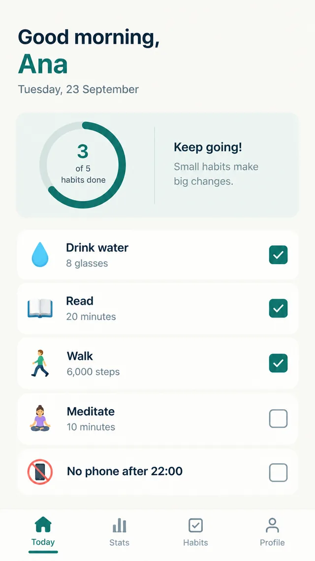
The example on this page is a mobile habit tracker screen. It shows the typical result for app UI: the structure and states are right, and the fixes are small and specific.

Mockup of a habit tracker app home screen: Good morning, Ana, a progress ring with 3 of 5 habits done, five habit rows with checkboxes and a bottom tab bar with Today, Stats, Habits and Profile
The mockup
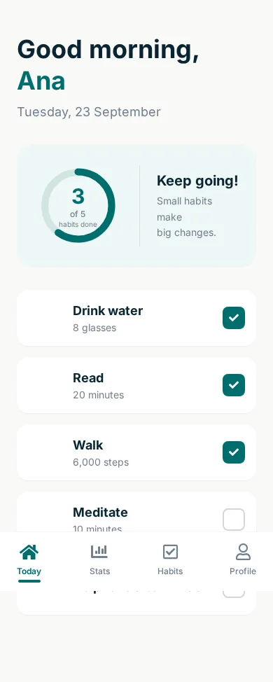
The generated HTML rendered at 390 pixels wide: greeting, progress ring, habit rows with checked and unchecked boxes and a fixed tab bar at the bottom
The generated page

A mobile app mockup

Mockup of a habit tracker app home screen: Good morning, Ana, a progress ring with 3 of 5 habits done, five habit rows with checkboxes and a bottom tab bar with Today, Stats, Habits and Profile
Input: Mobile app screen mockup (PNG, 864 x 1536)
The generated HTML rendered at 390 pixels wide: greeting, progress ring, habit rows with checked and unchecked boxes and a fixed tab bar at the bottom
Output: the generated HTML rendered in Chrome at 390px wide, unedited. 191 lines of HTML with Tailwind CSS, returned in 19 seconds.

What it got right

  • The greeting with the name in the teal accent colour, the date and the rounded summary card.
  • The progress ring, drawn in SVG, filled to match 3 of 5, with the Keep going! message beside it.
  • Five habit rows with the right checked and unchecked states, and a bottom tab bar with Font Awesome icons and the active tab underlined.

What to fix by hand

  • The emoji icons of each habit were written as placehold.co images with the emoji as text; they render as empty squares. Use the emoji directly or your own icons.
  • The tab bar is fixed to the bottom of the screen without padding on the list, so it covers the last habit. Add bottom padding the height of the bar.
habit-app-mockup.html (first lines of the body)
 <body class="text-[#0a2533] min-h-screen flex flex-col">
  <div class="max-w-md mx-auto w-full px-6 pt-12 pb-24 flex-grow">
   <!-- Header -->
   <header class="mb-8">
    <h1 class="text-4xl font-bold leading-tight">
     Good morning,
     <br/>
     <span class="text-[#006d6d]">
      Ana
     </span>
    </h1>
    <p class="text-[#708090] mt-2 text-lg">
     Tuesday, 23 September
    </p>
   </header>
   <!-- Progress Card -->
   <div class="bg-[#eef7f6] rounded-3xl p-6 mb-8 flex items-center">
    <div class="relative flex items-center justify-center w-32 h-32 mr-6">
     <svg class="w-full h-full">
      <circle class="text-[#d1e5e3]" cx="64" cy="64" fill="transparent" r="48" stroke="currentColor" stroke-width="10">
      </circle>
      <circle class="text-[#006d6d] progress-ring__circle" cx="64" cy="64" fill="transparent" r="48" stroke="currentColor" stroke-dasharray="301.59" stroke-dashoffset="120.63" stroke-linecap="round" stroke-width="10">
      </circle>
     </svg>
     <div class="absolute inset-0 flex flex-col items-center justify-center text-center">
      <span class="text-3xl font-bold text-[#006d6d]">
Open the full generated page (191 lines)

Reading the generated code

The 191-line file follows the image from top to bottom: a header block with the greeting, the summary card with an inline SVG for the progress ring, one div per habit and a nav fixed to the bottom for the tabs. Colors come from the image (the teal is applied as Tailwind arbitrary values), and the checked boxes are styled divs with a Font Awesome check, not form inputs. If you need them to toggle, turn them into checkboxes or buttons and add the state in your framework.

Getting code you can drop into an app

  1. Convert the image and review the preview at the width of the target device.
  2. Fix what the model could not know: the icon set you use, the data that should be dynamic, and the spacing under fixed bars (here, the tab bar covered the last habit).
  3. Switch the output to React, Vue or Angular in the editor. The markup becomes a component you can split into smaller ones, such as a HabitRow repeated five times.

Good inputs for image to code

  • Exports from design tools at 1x or 2x, where text is sharp.
  • One screen per image, so each conversion maps to one page or one component.
  • Real copy instead of lorem ipsum, because the text is transcribed as it is and you keep it.

For web pages you can see in a browser, the screenshot to code page has a desktop example. For design frames, the Figma to HTML walkthrough covers exporting. To sample exact colors from a mockup before you start, use the free image color picker.

Image to code questions

Which programming languages does image to code support?

The conversion produces HTML with Tailwind CSS. From the editor you can turn that into HTML with inline CSS, a ReactJS, VueJS or AngularJS component, or type the name of another framework. This page only shows the default Tailwind HTML output.

Does it work for mobile app designs?

Yes, as a web page. The habit tracker above was converted into a 390 pixel wide page with a fixed bottom tab bar. That is a good base for a web app or a prototype; for a native app, use it as a reference for the layout and the copy.

How are icons handled?

Common interface icons (home, chart, check, user, settings) are mapped to Font Awesome 5. Emoji, brand marks and custom icons are not always available there and may come back as placeholders or approximations, as in this example.

Can it read hand-drawn or low quality images?

It reads what a person could read. A clear phone photo of a paper wireframe works (there is an example on the image to HTML page); blurry text, tiny labels and heavy JPEG artifacts lead to guessed words, so check the copy.