一个导出为 PNG 的桌面端设计稿 Frame
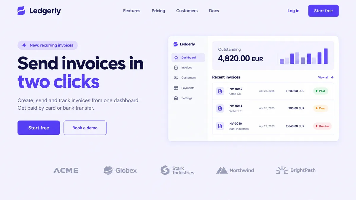
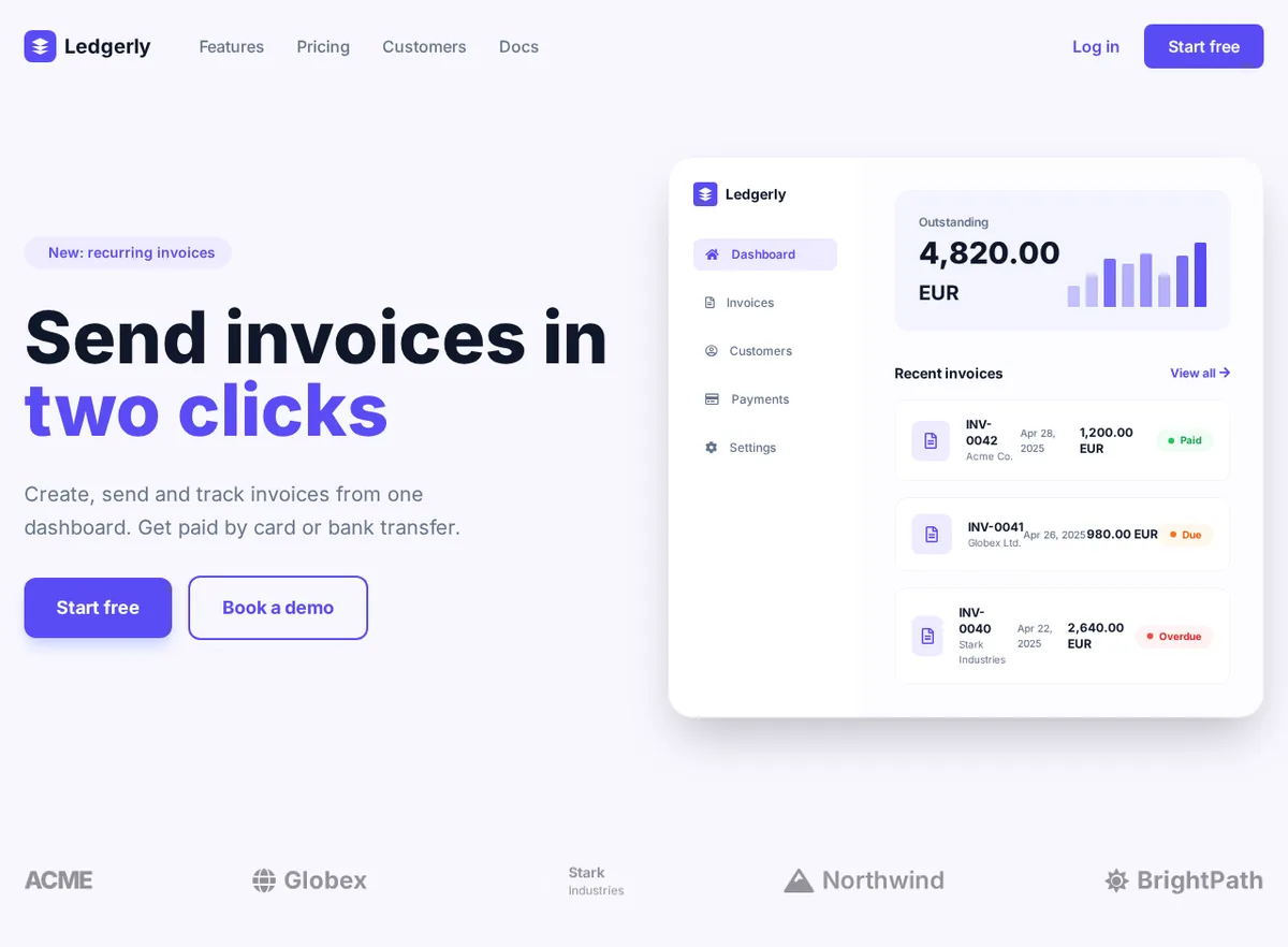
做对了什么
- 整个首屏:胶囊标签、双色标题、段落,以及实心和描边两种按钮,用的都是设计稿里的紫色。
- 仪表盘卡片是真正的 HTML:带当前选中项的侧边菜单、待收金额、用 div 搭出来的柱状图,以及三行发票,Paid、Due、Overdue 徽标分别是绿色、橙色和红色。
- 一排客户 logo,每个名称都是文字。
需要手动修改的地方
- logo 都是替代品:Ledgerly 的标志是一个通用的叠层 SVG,Globex 和 Northwind 用了 Font Awesome 图标,Stark Industries 那一块用了页面里从未定义的 bg-dark 类,所以看不见。换成你自己的 SVG。
- 胶囊标签里的闪光图标是 fa-sparkles,Font Awesome 5 免费版里没有这个图标,所以什么也不显示。
- 在 1280 像素宽度下发票行很挤,INV-0042 折成了两行。给右侧列多留些空间,或者缩短日期列。
ledgerly-frame.html(body 的开头几行)
 <body class="min-h-screen">
  <!-- Navigation -->
  <nav class="max-w-7xl mx-auto px-6 py-6 flex items-center justify-between">
   <div class="flex items-center space-x-12">
    <div class="flex items-center space-x-2">
     <div class="w-8 h-8 bg-primary rounded-lg flex items-center justify-center">
      <svg class="w-5 h-5" fill="white" viewbox="0 0 24 24">
       <path d="M12 2L2 7l10 5 10-5-10-5zM2 17l10 5 10-5M2 12l10 5 10-5">
       </path>
      </svg>
     </div>
     <span class="text-xl font-bold text-dark">
      Ledgerly
     </span>
    </div>
    <div class="hidden md:flex space-x-8 text-muted font-medium">
     <a class="hover:text-primary transition" href="#">
      Features
     </a>
     <a class="hover:text-primary transition" href="#">
      Pricing
     </a>
     <a class="hover:text-primary transition" href="#">
      Customers
     </a>
     <a class="hover:text-primary transition" href="#">