Introduction
Ever seen a website where the text flows smoothly around images, making everything look neat and tidy? It's not just about looking good - it's a smart way to keep readers interested and make things easier to read. If you're into making websites, knowing how to wrap text around images is a must-have skill.
In today's online world, first impressions matter a lot. Getting good at mixing text and images can really make your websites stand out. Whether you've been coding for years or you're just starting out, learning how to wrap text around images can take your projects to the next level.
So, grab a drink, get comfy, and let's dive into the world of HTML and CSS to see how we can make text wrap around images like a pro.
Understanding the Basics
Why Wrap Text Around Images?
Think of it like a book with pictures. When the words flow around the images, it just looks better, right? Here's why it's great for websites:
- Makes things look nicer
- Breaks up big chunks of text, so it's easier to read
- Draws attention to important pictures
- Balances out the design so nothing looks out of place
HTML and CSS Fundamentals
Before we get into the fancy stuff, let's cover the basics:
- HTML: It's like the skeleton of a webpage. It gives structure to everything.
- CSS: This is what makes things look good. It controls colors, fonts, and where things sit on the page.
Together, HTML and CSS are the dynamic duo that help you create awesome, good-looking websites.
Techniques to Wrap Text Around Images
There are a few ways to get text to wrap around images. Let's check them out:
Using the
float
Property
This is an oldie but a goodie. It's been around for ages and it's pretty simple to use.

Example:
<!DOCTYPE html>
<html>
<head>
<style>
  .float-image {
    float: left;
    margin: 0 15px 15px 0;
  }
</style>
</head>
<body>
  <img src="image.jpg" alt="Sample Image" class="float-image">
  <p>
    Lorem ipsum dolor sit amet, consectetur adipiscing elit. Proin vel urna nec sapien volutpat tincidunt.
  </p>
</body>
</html>
What's happening here:
-
float: left;makes the image stick to the left side. -
The
margingives some breathing room between the image and text.
Pros:
- Easy to use
- Works in pretty much all browsers
Cons:
- Can be a bit tricky if you're not careful
- Not as flexible as some newer methods
Flexbox for Flexible Layouts
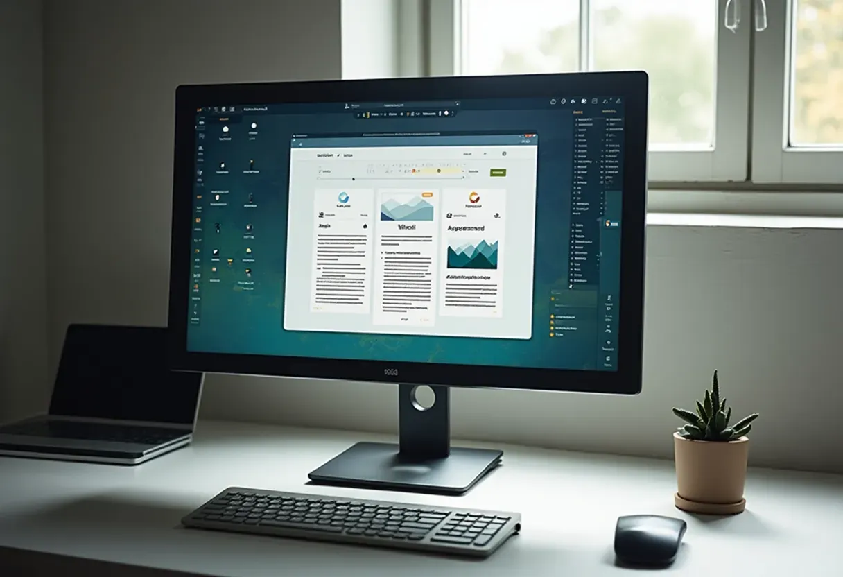
Flexbox is like the Swiss Army knife of layout tools. It's super flexible and gives you more control.
Example:
<!DOCTYPE html>
<html>
<head>
<style>
  .flex-container {
    display: flex;
    align-items: flex-start;
  }
  .flex-container img {
    margin-right: 15px;
  }
</style>
</head>
<body>
  <div class="flex-container">
    <img src="image.jpg" alt="Sample Image" width="200">
    <div>
      <p>
        Lorem ipsum dolor sit amet, consectetur adipiscing elit. Proin vel urna nec sapien volutpat tincidunt.
      </p>
    </div>
  </div>
</body>
</html>
What's going on:
-
display: flex;creates a flexible container. - The image and text line up side by side, with the image on the left.
Pros:
- You can control alignment and spacing better
- Works well on different screen sizes
Cons:
- A bit more complex than using floats
- Might not wrap text around images in the traditional way
CSS Grid for Advanced Control
CSS Grid is like the boss of layout systems. It gives you amazing control over complex designs.
Example:
<!DOCTYPE html>
<html>
<head>
<style>
  .grid-container {
    display: grid;
    grid-template-columns: 200px 1fr;
    grid-gap: 15px;
  }
  .grid-container img {
    grid-column: 1 / 2;
    grid-row: 1 / 2;
  }
  .grid-container p {
    grid-column: 2 / 3;
    grid-row: 1 / 2;
  }
</style>
</head>
<body>
  <div class="grid-container">
    <img src="image.jpg" alt="Sample Image">
    <p>
      Lorem ipsum dolor sit amet, consectetur adipiscing elit. Proin vel urna nec sapien volutpat tincidunt. Vivamus sollicitudin
      nisl at velit cursus, at congue neque tristique.
    </p>
  </div>
</body>
</html>
What's happening:
-
display: grid;sets up a grid layout. - We create two columns, one fixed and one flexible.
- The image goes in the first column, and the text takes up the second.
Pros:
- Super flexible and precise
- Great for complex layouts with lots of elements
Cons:
- Takes a bit more time to learn
- Might be overkill for simple text wrapping
Advanced Strategies and Modern Trends
Responsive Design Considerations
These days, people view websites on all sorts of devices. Making sure your text and images look good on everything from big desktop screens to tiny phones is super important.
- Use media queries to adjust layouts for different screen sizes
- Make images flexible so they can shrink or grow
- Use CSS Flexbox and Grid - they're naturally good at adapting to different screens
Example:
@media (max-width: 600px) {
  .float-image {
    float: none;
    display: block;
    margin: 0 auto 15px;
  }
}
This means: When the screen is 600px wide or less, the image stops floating and sits nicely centered above the text.
Accessibility Best Practices
Making sure everyone can use your website, including people who might be using screen readers or other assistive tech, is really important. Here's how to make your text and images more accessible:
- Always add alt text to images
- Make sure there's enough contrast between text and background
- Adjust layouts so they don't mess up screen readers
- Check that people can navigate with just a keyboard
Example:
<img src="image.jpg" alt="A beautiful sunset over the mountains" class="float-image">
The
alt
text here describes the image for people who can't see it.
SEO Implications
How you arrange your text and images can affect how well your site shows up in search results. Well-wrapped text can make your site more readable, which search engines like.
-
Use the right HTML tags for images (like
<figure>and<figcaption>) - Use lazy loading for images to speed up your page
- Give your image files descriptive names
Example:
<figure>
  <img src="sunset-mountains.jpg" alt="A beautiful sunset over the mountains">
  <figcaption>Sunset over the scenic mountains.</figcaption>
</figure>
Using
<figure>
and
<figcaption>
helps search engines understand what the image is about.
Tools and Resources
IMG2HTML: Transforming Images to Code
IMG2HTML is a cool tool that uses AI to turn images into HTML and CSS code. It's pretty amazing and can save you tons of time.
- Turns images into web-ready code automatically
- Makes sure the code works on different devices
- Works with stuff like Tailwind CSS, React, Vue, and Angular
- Can even read and keep text from images
I remember spending hours trying to code a complex design. Tools like IMG2HTML have made life so much easier. Now we can focus more on being creative and less on boring coding tasks.
- Saves a ton of time
- Creates perfect code with fewer mistakes
- Works with lots of different frameworks, so it's useful for all kinds of projects
How to use it:
Say you've got a screenshot of a cool webpage. You can upload it to IMG2HTML, and in no time, you'll get HTML and CSS code ready to use in your project.
You can try this feature yourself at IMG2HTML .
Other Essential Tools
While IMG2HTML is great, there are other tools that can help too:
- Adobe XD and Figma : For designing and prototyping websites
- Bootstrap : A popular CSS framework for making responsive sites
- Sass : Makes CSS more powerful and easier to use
- Google Lighthouse : Checks how good your web pages are
Optimizing for Performance
Having a website that looks good is great, but it needs to load fast and run smoothly too. Here's how to make sure it does:
Image Optimization
Big images can slow down your website. Optimizing them means making them smaller without making them look bad.
- Use tools like TinyPNG or ImageOptim to compress images
- Use different image sizes for different devices
- Try using newer image formats like WebP
Example:
<img src="sunset-mountains.webp" alt="A beautiful sunset over the mountains" width="600" height="400">
WebP images are usually smaller but still look good, so your page loads faster.
Efficient CSS Practices
Good CSS not only makes your site run better but also makes it easier to update later.
- Remove extra spaces and comments from your CSS
- Combine multiple CSS files into one
- Use CSS variables to make it easier to change colors and stuff
Example:
:root {
  --main-color: #3498db;
  --text-color: #2c3e50;
}

body {
  color: var(--text-color);
  background-color: var(--main-color);
}
Using CSS variables like this makes it easy to change colors across your whole site.
Building Quality User Experience
A well-designed layout with text wrapped around images can make your website much nicer to use. Here's how to focus on making things great for users:
Visual Hierarchy and Readability
Making things clear and easy to read helps guide people through your content.
-
Use headings properly (
h1,h2,h3, etc.) - Choose fonts that are easy to read
- Leave enough white space so things don't look crowded
Example:
<h2>Beautiful Sunset</h2>
<img src="sunset-mountains.jpg" alt="A beautiful sunset over the mountains" class="float-image">
<p>
  Witness the mesmerizing hues of the sunset as it paints the sky over the majestic mountains.
</p>
This setup makes it clear what the section is about and how the image relates to the text.
Interactive Elements and Enhancements
Adding little interactive bits can make your website more engaging.
- Make images do something when you hover over them
- Let users click on images to see them bigger
- Add tooltips that show extra info when you hover over things
Example:
.float-image:hover {
  transform: scale(1.05);
  transition: transform 0.3s;
}
This makes the image slightly bigger when you hover over it, which looks pretty cool.
Effective Strategies for Success
Getting text and images to work perfectly together takes some planning. Here are some tips:
Planning Your Layout
Before you start coding, sketch out how you want things to look. It helps a lot.
- Figure out which images and text are most important
- Draw rough layouts to see how things will fit
- Decide whether to use floats, Flexbox, or Grid based on how complex your design is
Once, I jumped into coding without planning and ended up with a mess. Taking time to sketch things out first would have saved me a lot of headaches.
Testing Across Devices
Make sure your layout works well on all kinds of devices for a good user experience.
- Use tools like Chrome DevTools to see how your site looks on different screen sizes
- Test on real phones and tablets when you can
- Use flexible units like percentages instead of fixed pixels
Iterative Improvements
Web design is always changing. Keep improving your layouts based on what users say and how well your site is doing.
- Ask users for feedback
- Use tools like Google Analytics to see how people use your site
- Try different layouts to see which ones work best
Keeping at it helps make sure your website stays useful and up-to-date.
Conclusion
Wrapping text around images in HTML isn't just about making things look pretty. It's a smart way to make your website more engaging, easier to read, and just better overall. Whether you use the old-school float method or newer stuff like Flexbox and CSS Grid, each way has its own perks.
Tools like IMG2HTML can make your work a lot easier, turning images into code without you having to do all the hard work. When you combine this with good practices for responsive design, accessibility, and making your site run fast, you're all set to make awesome, user-friendly websites.
Remember, the key is to balance looking good with working well. By getting good at wrapping text around images, you're on your way to making websites that not only look great but also work really well.
So, ready to take your web design skills up a notch? Start playing around with these techniques today, and watch your websites turn into something really special that people will love using.
You might also like
-
How to Use IMG2HTML
Learn the step-by-step process of converting your images into HTML and CSS using IMG2HTML.
Read More -
IMG2HTML Pricing
Explore the different pricing plans of IMG2HTML to find the one that suits your needs best.
View Pricing -

Optimizing Your HTML Code
Learn essential tips and tricks to clean and optimize your HTML code for better performance.
Read More