Turning your visual ideas into a working website can feel like bringing a painting to life. Whether you're a pro developer or just starting out with web design, getting good at converting images to HTML is super important. This guide will walk you through the best ways to make sure your image-to-HTML conversions are spot-on, efficient, and ready for today's web.
Introduction
Ever seen an amazing website and thought, "How did they do that?" You're not alone! These days, visuals are super important for grabbing attention and keeping visitors interested. But turning those cool designs into clean, working HTML code can be tricky. Don't worry though! Whether you're using Photoshop , Figma , or just sketching ideas on paper, turning images into HTML can be easy if you know what you're doing. Let's look at some great ways to turn your visual ideas into real websites.

1. Choose the Right Image
Think about building a house with mismatched stuff - it might look cool at first, but it could fall apart later. Picking the right image for your website is like laying a good foundation for how people see and use your site.
Why It Matters:
- First Impressions: A good, high-quality image can make your site look professional and trustworthy.
- Keep People Interested: Clear, engaging images keep visitors looking and wanting to explore more.
- Good for SEO: Choosing the right images can help your site show up better in search results.
Tips:
- Make It Clear: Use high-quality images that aren't blurry.
- Make It Relevant: Pick images that fit with what you're saying and your brand.
- Make It Engaging: Choose visuals that your audience will like and that make them feel something.
I remember the first time I used a blurry banner image on my website. Within days, people were leaving the site super fast and not sticking around. Using a sharp, clear image made a huge difference!
Example of a Good Image
A high-quality, relevant image enhances the overall look and feel of your website.
2. Make Images Load Fast
Nothing says "slow website" like an image that takes forever to load. Making your images load quickly keeps your site fast and user-friendly.
Why It Matters:
- Better for Users: Fast-loading images make the whole experience better, keeping visitors happy.
- Better for Search Engines: Search engines like websites that load quickly, which can help more people find you.
- Saves Data: Smaller image sizes use less data, which is good for you and your visitors.
Tips:
- Compress Images: Use tools like TinyPNG or IMG2HTML to make file sizes smaller without making the image look bad.
- Size Them Right: Make sure images are the right size for where they'll be shown.
- Use the Right Format: Use JPEGs for photos, PNGs for graphics with see-through parts, and WebP for a good mix of quality and small file size.
Think of making images smaller like packing for a trip. You want to bring what you need without overstuffing your suitcase. Similarly, make your images just right without slowing down your site.
4. Write Good Alt Text
Alt text isn't just for SEO; it's really important for making your site accessible to people who can't see images.
Why It Matters:
- Accessibility: Screen readers use alt text to describe images to people who can't see them.
- SEO: Search engines use alt text to understand what images are about.
Tips:
- Be Descriptive: Clearly say what's in the image.
- Keep It Short: Try to use about 125 characters or less.
- Don't Overdo Keywords: Use relevant keywords naturally, but don't stuff them in.
Example: Instead of
<img src="image1.jpg" alt="image1">
, use
<img src="image1.jpg" alt="A group of friends enjoying a picnic in the park">
.
I like to think of alt text as storytelling. It's your chance to describe what's in the picture to someone who can't see it.
5. Make Your Site Look Great on Any Device
With so many devices out there - smartphones, tablets, computers - making sure your website looks good everywhere is super important.
a. Using Responsive Design
Responsive design makes your site adjust to fit different screen sizes.
Tip: Use flexible layouts and media queries to change your design based on the device's screen size.
b. Using CSS Media Queries
Media queries let you apply specific CSS rules based on the device's characteristics.
@media only screen and (max-width: 768px) {
  .hero {
    background-image: url('hero-small.jpg');
  }
}
c. Using the
srcset
Attribute
The
srcset
attribute lets you give different image options for different screen sizes.
<img src="small.jpg" srcset="medium.jpg 600w, large.jpg 1200w" alt="Responsive image example">
It's like having different outfits for different occasions. You wear the perfect one depending on where you're going!

6. Try New Image Formats
Old formats like JPEG and PNG are good, but newer ones like WebP and AVIF can make images smaller and look better.
a. Looking at WebP and AVIF
- WebP: Makes images smaller without making them look bad.
- AVIF: Makes images even smaller and can do cool things like HDR.
Tip: Try changing your images to WebP or AVIF to make your site load faster and work better.
b. Using the
<picture>
Tag
The
<picture>
tag lets you give different image options, so it works well in all browsers.
<picture>
  <source srcset="cool-image.avif" type="image/avif">
  <source srcset="cool-image.webp" type="image/webp">
  <img src="cool-image.jpg" alt="A cool picture of web design">
</picture>
When I switched to WebP for my blog images, my pages loaded almost twice as fast, which made the site better for users and helped with search rankings!
7. Style Images with CSS
CSS isn't just for text and layouts; it's great for making your images look even better.
a. Making Reusable CSS Classes
Instead of styling each image separately, make classes you can use over and over to keep things consistent and make your code simpler.
.round-image {
  border-radius: 15px;
  box-shadow: 0 4px 8px rgba(0,0,0,0.2);
}
How to use it:
<img src="profile.jpg" alt="My profile picture" class="round-image">
b. Making Images Look Better with CSS
Use things like
object-fit
,
object-position
, and
aspect-ratio
to control how images show up in their containers.
.my-image {
  aspect-ratio: 16/9;
  width: 100%;
  object-fit: cover;
}
Think of
object-fit
like arranging a picture in a frame - you want it to look just right, whether you're cropping it or stretching it.
Styling with CSS
Using reusable CSS classes ensures consistency and simplifies your codebase.
8. Make Sure It Works in All Browsers
Your website should look and work the same no matter what browser people use.
Why It Matters:
- Reach More People: Making sure it works in different browsers means more people can use your site.
- Look Professional: A site that works well everywhere makes you look good.
Tips:
- Test Often: Use tools like BrowserStack to check your site in major browsers (Chrome, Firefox, Safari, Edge).
- Have Backups: Include backup options in your code for browsers that don't support certain features.
- Stay Up to Date: Keep an eye on browser updates and change your practices if you need to.
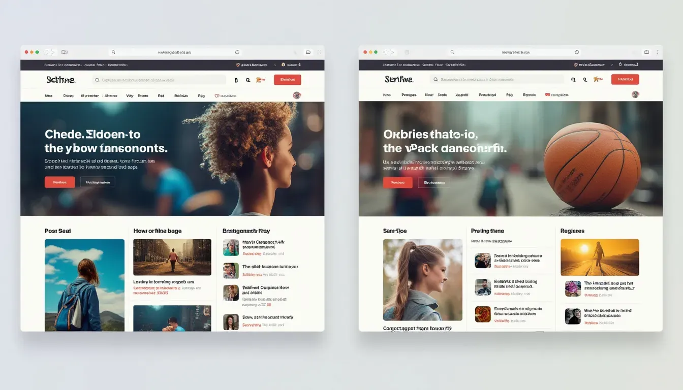
Ever noticed how a site looks perfect in Chrome but has problems in Safari? Testing regularly can stop these issues before they start!
9. Use Lazy Loading
Loading all images at once can slow down your site, especially if you have a lot of images. Lazy loading makes images load only when they're needed.
Why It Matters:
- Faster Initial Load: Makes the user experience better by showing content quickly.
- Saves Data: Saves data for users by only loading images when they scroll to them.
How to Do It:
Add
loading="lazy"
to your
<img>
tags.
<img src="gallery1.jpg" alt="First gallery image" loading="lazy">
Tip: Don't use lazy loading for images at the top of the page so your most important visuals load right away.
When I started using lazy loading on my portfolio site, it made the initial page load feel super fast. It's a game-changer!
10. Check and Test Your Work
Even the best plans can go wrong if you don't check and test properly.
Why It Matters:
- No Errors: Makes sure your site works smoothly without bugs.
- Better SEO: Clean, correct code is better for search engines.
Tips:
- Use Checking Tools: Tools like the W3C Markup Validation Service can help find and fix HTML errors.
- Test It Yourself: Besides using tools, test your site yourself on different devices and browsers.
- Ask Others to Look: Sometimes, someone else can spot things you missed.
Think of checking your work like proofreading an essay. It's all about catching mistakes before showing it to everyone.

13. Useful Tools
Turning images into HTML can take a long time, but with the right tools, it becomes much easier.
a. IMG2HTML
A powerful tool that uses AI to turn images into clean, responsive HTML and CSS code. It saves time and is accurate, making it great for beginners and pros.
Features:
- One-Click Conversion: Turn images into code easily.
- Customization Options: Choose frameworks like ReactJS, VueJS, or AngularJS.
- Tailwind CSS Integration: For responsive and modern designs.
- API Access: Automate the conversion process for bigger projects.
You can try this feature yourself at IMG2HTML .
b. Code Editors
Tools like Visual Studio Code , Sublime Text , and Atom have features that make coding faster and easier.
Tips:
- Extensions: Use extensions for HTML and CSS to work faster.
- Syntax Highlighting: Makes code easier to read and fix.
c. Online Converters
Web tools like Online-Image-Editor , ConvertImage , and ImageMagick Online can quickly turn images into HTML.
Pros:
- Convenient: No need to install anything.
- Fast: Quick conversions for small tasks.
Cons:
- Limited Features: Might not have as many options for customization.
d. Design Tools
Platforms like Canva are easy to use for designing and exporting HTML code.
Features:
- Drag-and-Drop Interface: Makes designing easier.
- Export Options: Easily export your designs as HTML code.
See how this works at IMG2HTML .
14. Quick Recap of Best Practices
Let's quickly go over the best ways to make sure your image-to-HTML conversions are top-notch:
- Choose Good Images: Start with clear, relevant visuals.
- Make Them Load Fast: Compress and size images properly.
-
Know the
<img>Tag: Understand and use its attributes effectively. - Write Good Alt Text: Make your site accessible and better for SEO.
- Make It Responsive: Make your site look great on all devices.
- Use New Formats: Try WebP and AVIF for better performance.
- Style with CSS: Keep things consistent and looking good.
- Test in Different Browsers: Make sure it works well for everyone.
- Use Lazy Loading: Make pages load faster and use less data.
- Check and Test: Keep your code clean and error-free.
These practices not only make your site work better but also make sure visitors have a great experience, keeping them interested and coming back.
15. Wrapping Up
Turning images into HTML doesn't have to be super hard. By following these best practices, you can create beautiful, fast-loading, and responsive websites that give users a great experience. The key is to balance how good it looks with how well it works, making sure your site is both beautiful and efficient.
Final Thought: Web design is always changing, so staying up to date with the latest tools and techniques makes sure your website stays relevant and interesting. Use these practices, and watch your web projects get better and better!
16. What to Do Next
Ready to make your web design even better? Start using these best practices today and turn your visual ideas into amazing websites. Don't let old techniques hold you back - try new ways of turning images into HTML and create sites that wow people. Happy coding!