Intro: The Future of Web Design is Here
Hey there! Ever landed on a website on your phone and thought, "Wow, this looks great!" then switched to your laptop to find it looks just as awesome? That's responsive web design in action, my friend!
These days, making a website that looks good on any device isn't just nice to have – it's a must. Whether someone's checking out your site on a tiny phone screen or a massive desktop monitor, it needs to look and work perfectly.
But here's the thing: one of the biggest headaches in responsive design is dealing with images. They're super important for making your site look good, but they can be a pain to manage across different screen sizes. That's where Img2HTML comes in. This cool tool uses AI to turn your images into responsive HTML and CSS code in seconds. It's like magic, but for web design!
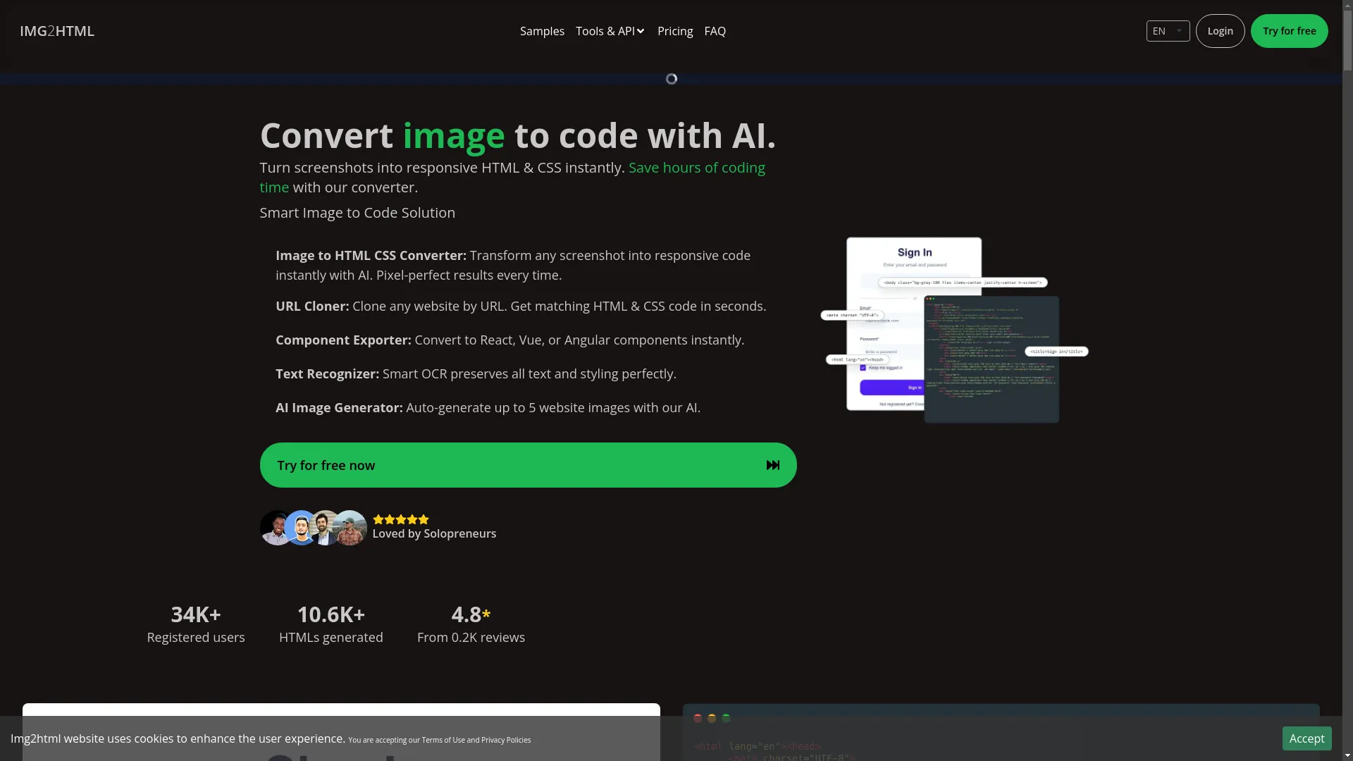
Experience the magic of converting designs with Img2HTML.
Before we dive into all the nitty-gritty of using images to make killer responsive websites, let's take a sec to appreciate why this stuff matters. Imagine if every website looked perfect no matter what you're using to view it. That's what responsive web design is all about – and we're gonna help you make it happen.
So grab a drink, get comfy, and let's learn how to make websites that look amazing everywhere. By the time we're done, you'll be all set to create sites that are not just pretty, but work great on any device.
Getting to Know Responsive Images
What's the Deal with Responsive Images?
Okay, let's start with the basics. You might be wondering, "What exactly are responsive images?" Well, it's pretty simple. Responsive images are pictures that change size and quality based on the screen they're shown on. So whether someone's looking at your site on a big computer screen or a tiny phone, the images always fit just right and look sharp.
Think of it like those stretchy pants that fit no matter what. A responsive image is like that – it fits perfectly whether you're on a phone, tablet, or computer.
Why Responsive Images Matter in Today's Web Design
- Better User Experience: Nobody likes weird-looking images that don't fit the screen. Responsive images make sure everything looks good, no matter what device people are using.
- Faster Websites: Big, clunky images can slow down your site. Responsive images help your site load faster by showing the right size image for each device.
- Good for SEO: Google likes websites that work well on mobile devices. Using responsive images can give your site a boost in search rankings.
- Saves Data: For people using their phones with limited data plans, responsive images are great because they don't waste data by loading huge images on small screens.
Basically, responsive images are the unsung heroes of modern websites. They work behind the scenes to make sure your site looks awesome and works great on any device.
Enhance Your SEO with Responsive Images
Learn how optimizing images for different devices can improve your search engine rankings.
Boost Your WorkflowUsing AI to Turn Images into Responsive Code
Meet Img2HTML: Your New Coding Buddy
Picture this: You've got this awesome design for a webpage, but turning it into actual code that works on all devices feels like trying to solve a Rubik's cube blindfolded. That's where Img2HTML comes in – it's like having a super smart friend who's really good at coding.
Img2HTML does something pretty cool: it takes any image or screenshot and turns it into clean, responsive HTML and CSS code in just a few seconds. Whether you're a pro developer looking to save time or a newbie designer who wants to see their ideas come to life without diving into code, Img2HTML's got your back.

How Img2HTML Does Its Magic: A Quick Rundown
- Upload Your Image: Just upload a screenshot or picture of your web design to Img2HTML.
- AI Does Its Thing: Img2HTML's smart AI looks at your image and figures out all the parts of your design.
- Get Your Code: In no time, you get clean HTML and CSS code that's all set to be responsive. This means your website will look great on phones, tablets, and computers.
- Tweak If You Want: While Img2HTML does most of the work, you can still change things up if you need to.
It's like having a personal assistant who handles all the boring coding stuff, so you can focus on making your website look awesome.
Real Examples: From Screenshot to Awesome Website
Let's say you've just drawn up a cool design for your new blog's homepage. You take a screenshot, upload it to Img2HTML, and boom – in seconds, you've got a fully responsive HTML and CSS template that looks just like your design. No more spending hours writing code or worrying about how it'll look on different devices.
Or maybe you're a developer and your client gives you a bunch of designs to turn into a website. With Img2HTML, you can speed up your work big time. It makes sure everything looks consistent and works well on all devices. It's a win-win – you save time, and your clients get a great-looking, responsive website.