What's Inside
Intro
Ever sent out an email campaign thinking it looked amazing, only to find out Gmail turned your fancy fonts into boring old Arial? Yeah, it sucks. But don't worry, you're not the only one pulling your hair out over this. Tons of marketers and developers deal with Gmail's font shenanigans. Good news though - we're gonna dig into why this happens, how to fix it, and share some cool tools to make your emails look awesome no matter where they end up.
What's Going On?
2.1 Why's Gmail Messing with My Fonts?
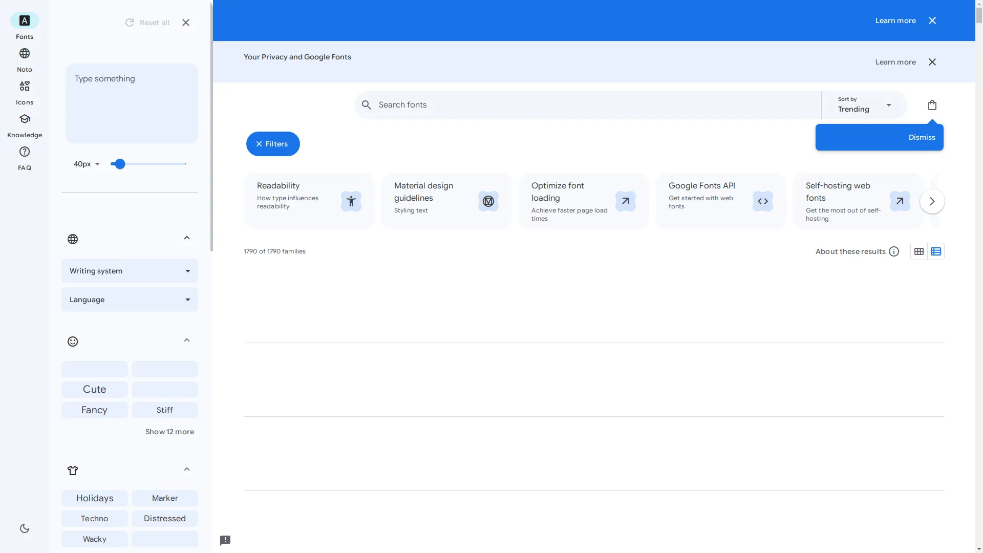
Gmail's got its own rulebook when it comes to showing HTML emails. One of the big reasons it messes with your fonts is that it doesn't play nice with most custom web fonts. So even if you picked out this super cool font from Google Fonts , Gmail might just ignore it and use something boring instead.
It's kinda like getting all dressed up for a party, but when you get there, the host makes everyone wear the same t-shirt. Annoying, right?
2.2 When Does This Usually Happen?
Here's when you might see Gmail changing your fonts:
- You're using fancy web fonts it doesn't like
- You didn't set up the fonts quite right
- You put your CSS in the wrong spot
- You forgot to give Gmail a backup font option
Why Consistent Fonts Matter
3.1 It's All About Your Brand, Baby
Your fonts aren't just there to make things readable - they're part of your brand's personality. The fonts you pick can make your brand feel professional, fun, fancy, or bold. When your fonts stay the same across all your emails, it helps people remember who you are.

Think about it - if you got two different business emails, one in boring Arial and another in a cool, custom font, which one would you remember?
3.2 Don't Forget the User
When your fonts look good and are easy to read, people actually want to read your emails. If your fonts are all over the place or hard to read, folks might just give up before they even get to your message. Making sure your fonts look right in Gmail (and everywhere else) keeps your readers happy.
Web Fonts vs. Old Reliables
4.1 What's a Web Font Anyway?
Web fonts are like the cool new kids on the block. They're fonts that aren't already on someone's computer but get loaded up when they open your email or webpage. Places like Google Fonts and Adobe Fonts have tons of these, giving designers way more options than just the usual boring fonts.
4.2 The Trusty Web Safe Fonts
Web safe fonts are like your old reliable friends. They're the fonts that pretty much every computer already has, like Arial, Helvetica, Times New Roman, and Verdana. Since they're already installed, you don't have to worry about them not showing up right.

4.3 Pros and Cons - You Decide
| Web Fonts | Web Safe Fonts |
|---|---|
|
|
|
|
Which Email Apps Play Nice with Web Fonts?
5.1 The Good Guys
Some email apps are cool with web fonts:
- Apple Mail: Loves web fonts, no problem.
- iOS Mail: Just like Apple Mail, it's all good.
- Android Mail (but not Gmail): Usually okay with web fonts.
- Thunderbird: Pretty good with web fonts.
- Outlook on Mac: Okay with some web fonts, but not all.
5.2 The Party Poopers
But some email apps just don't want to play:
- Gmail (Web & App): Super picky, only likes a few fonts like Roboto.
- Outlook on Windows: Nope, doesn't like web fonts at all.
- Yahoo! Mail: Usually says no to most web fonts.
- AOL Mail: Not a big fan of web fonts either.

Knowing where most of your readers check their email can help you decide if it's worth using web fonts or if you should stick with the safe ones.
Tricks to Make Gmail Behave
6.1 Inline CSS - Your New Best Friend
One of the best ways to make sure your fonts stick in Gmail is to use inline CSS. Instead of putting your styles in the
<head>
or in a separate file, you put them right on the HTML elements. Gmail's less likely to mess with these.
<span style="font-family: 'Open Sans', Arial, sans-serif;">Your Text Here</span>
By listing a few fonts, you're giving Gmail some options if it doesn't like your first choice.
6.2 Backup Fonts - Always Have a Plan B
Always include a backup font in your
font-family
. This way, if the first font doesn't work, the email will use the next one on the list.
<p style="font-family: 'Roboto', Helvetica, Arial, sans-serif;">Welcome to our newsletter!</p>
If Roboto doesn't work, it'll try Helvetica, then Arial, and finally any sans-serif font.
6.3 @font-face - Worth a Shot
Gmail doesn't usually like
@font-face
, but using it can help in other email apps that do support it. Here's how:
-
Set up the font:
<style> @font-face { font-family: 'Roboto'; font-style: normal; font-weight: 400; src: url('https://fonts.gstatic.com/s/roboto/v27/KFOmCnqEu92Fr1Mu4mxKKTU1Kg.woff2') format('woff2'); } </style> -
Use it inline:
<p style="font-family: 'Roboto', Arial, sans-serif;">Hello World!</p>
This won't fix Gmail, but it'll help in other places.
6.4 Outlook's Special Treatment
Outlook's weird and needs its own rules sometimes. You can use conditional comments to give Outlook special instructions without messing up other email apps.
<!--[if mso]>
<style>
  .custom-font { font-family: Arial, sans-serif !important; }
</style>
<![endif]-->
<p class="custom-font" style="font-family: 'Roboto', Helvetica, Arial, sans-serif;">Hello Outlook Users!</p>
This makes sure Outlook users see Arial, while everyone else gets Roboto or whatever's next on the list.
6.5 Test, Test, and Test Again
Before you hit send on your email campaign, always check how it looks in different email apps. Tools like Img2HTML , Litmus , and Email on Acid can show you how your email will look in all sorts of places, so you can fix any problems before they happen.
Cool Tools for Font Wrangling
7.1 Img2HTML - Your Secret Weapon
Img2HTML is this awesome tool that turns pictures into clean, responsive HTML and CSS code using AI. It works with stuff like Tailwind CSS, React, Vue, and Angular, making it super easy to use cool fonts and designs in your emails.
- Saves you tons of time coding
- Makes sure everything looks perfect
- Works with modern coding frameworks
7.2 Litmus - See It Before You Send It
Litmus is like a Swiss Army knife for email testing. It lets you see how your email will look on over 100 different devices and email apps, so you know your fonts and everything else will look right.
- Shows you email previews everywhere
- Checks if your email might end up in spam
- Lets teams work together easily
7.3 Email on Acid - Another Testing Buddy
Email on Acid is another great tool for testing emails. It makes sure your fonts and designs look good no matter where people read your email. It's also got some cool tools for working with your team and making your emails better.
- Tests your email on tons of platforms before you send it
- Tells you how well your email did
- Helps fix common email problems
Font Tips for Killer Emails
8.1 Picking the Right Fonts
Choose fonts that match your brand and are easy to read. Sans-serif fonts like Arial, Helvetica, and Verdana are usually safe bets, but serif fonts can look fancy if that's your style.
8.2 Keep It Simple, Stupid
Don't go crazy with too many different fonts or styles. Too much variety can make your email look messy and confuse people. Stick to a clean, consistent look that makes your message stand out.
8.3 Make Sure Everyone Can Read It
Think about people who might have trouble seeing. Use fonts that are easy to read, make sure there's enough contrast between your text and background, and don't use fonts that are too small or too fancy.
<p style="font-family: Arial, sans-serif; color: #333333;">Easy to read text right here!</p>
Real Talk
9.1 That Time Gmail Ruined My Day
I remember the first time I sent out an email I spent hours designing, only to find out Gmail had turned all my cool fonts into boring old Arial. It felt like I'd built this awesome sandcastle just to watch the tide wash it away. That's when I learned how important it is to test emails in different apps and always have a backup plan.

9.2 Companies That Got It Right
Take Apple, for example. Their emails always look clean and simple, with fonts that match their brand perfectly. They're careful to pick fonts that work everywhere, so their emails always look professional and you know it's from Apple right away.
Wrapping It Up
10.1 The TL;DR Version
Dealing with Gmail's font issues can be a pain, but understanding why it happens and knowing how to fix it can make a big difference. From using inline CSS and backup fonts to using cool tools like Img2HTML, Litmus, and Email on Acid, there are lots of ways to make sure your emails look great no matter where they end up.
10.2 What Now?
Take a look at your current email designs and see where you're having font problems. Try out the tricks we talked about, and use the tools we mentioned to test and improve your emails. Remember, having consistent fonts not only makes your emails easier to read but also makes your brand stronger.
10.3 Go Forth and Conquer Those Fonts!
Don't let Gmail mess up your awesome email designs with weird font changes. Take control of your email fonts today by using these tricks. Get into making emails with fonts that look great and make people want to read what you have to say. Ready to make your email campaigns even better? Start using these tips and watch your emails shine in every inbox!
Related Articles
- How to Use Img2HTML - Learn the basics of utilizing Img2HTML for converting images to HTML and CSS seamlessly.
- Top 10 Tools for Converting Images to Responsive HTML and CSS Code - Explore the best tools available for transforming your images into responsive web code.
- Boost Your Workflow Using Img2HTML API for Automated Conversions - Discover how the Img2HTML API can streamline your web development process.