Customizing Stylesheets For Html Viewer And Report Manager
Boost your web projects by customizing stylesheets for HTML viewers and report managers. Learn trends, tools, and techniques for optimal styling!
Table of Contents
- Intro
- Why Customize Stylesheets?
- What's Hot in Stylesheet Customization
- Smart Ways to Customize Stylesheets
- Must-Have Tools for Stylesheet Tweaking
- Tech Advances Making Stylesheet Customization Easier
- Keeping Up with the Trends
- Building Your Stylesheet Network
- Strategies for Success
- User Experience and Performance Matter
- Wrapping Up
Intro
Ever looked at a website or report and thought "Man, I wish I could just tweak this a bit to make it look better"? You're not alone! Customizing stylesheets for HTML viewers and report managers can really level up your web dev and data presentation game. Whether you're a CSS pro or just getting started, knowing how to tailor styles to fit your needs can make your projects look awesome and work smoothly.
Just imagine turning a boring old report into something that looks great and is fun to use, all with a few lines of code. Pretty cool, right? Stick around and we'll dive into the ins and outs of stylesheet customization, checking out the latest trends, smart strategies, and essential tools to make your HTML viewers and report managers shine.

Why Customize Stylesheets?
Let's talk about why customizing stylesheets is such a big deal. Think of a stylesheet like the clothes your website or report wears. Just like how clothes show off your style, stylesheets control how your digital stuff looks. Customizing them lets you:
- Match your brand: Keep everything looking consistent with your colors, fonts, and overall vibe.
- Make users happy: Create interfaces that are easy and fun to use.
- Include everyone: Make sure your content works for all users, including those with disabilities.
- Speed things up: Optimize styles so everything loads faster and runs smoother.
Customizing stylesheets isn't just about making things look pretty (though that's definitely a nice bonus). It's about creating an experience that clicks with users and fits what your project needs.
What's Hot in Stylesheet Customization
Keeping up with the latest trends in stylesheet customization can really boost the quality and efficiency of your projects. Let's check out some of the coolest things happening in the CSS world.
Modern CSS Frameworks
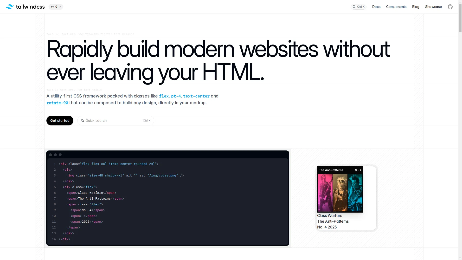
Gone are the days when you had to write every bit of CSS from scratch. Now we've got frameworks like Tailwind CSS , Bootstrap, and Foundation that give you pre-made components and tools to speed things up. Tailwind, for example, has these utility classes that let you style stuff super fast right in your HTML. It's really popular because it's flexible and doesn't come with a bunch of extra stuff you don't need.
CSS-in-JS Solutions
CSS-in-JS has totally changed how we think about styling in modern web apps. Libraries like Styled-Components and Emotion let you write CSS right inside your JavaScript code. This approach is all about component-based design, which keeps styles organized and easy to manage. If you've ever gotten frustrated with global CSS conflicts or struggled with huge stylesheets, CSS-in-JS might be just what you need.

Responsive Design Paradigms
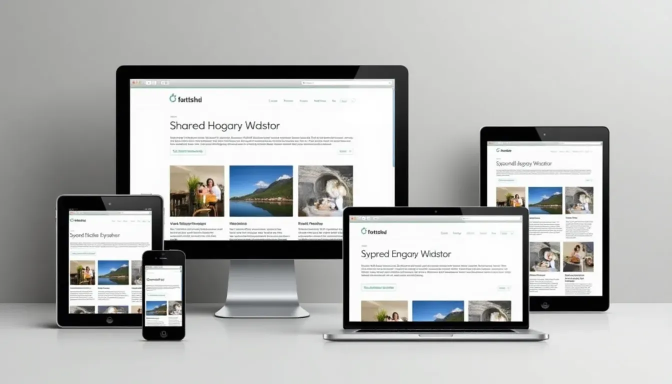
With everyone using phones and tablets these days, responsive design isn't just nice to have - it's a must. Techniques like Flexbox and CSS Grid are super important for creating layouts that look good on any screen size. Plus, the whole "mobile-first" design idea makes sure your styles focus on the most important stuff for smaller screens, which makes everything work better on all devices.
Smart Ways to Customize Stylesheets
Customizing stylesheets can sometimes feel like trying to solve a puzzle. But don't worry! Here are some tricks to help you stay on track and make sure your styles work well and look great.
Modular CSS Architecture
Using a modular approach to CSS can make your styles way more organized and easier to scale up. By breaking your stylesheet into reusable bits and pieces, you can handle even really complex stylesheets without losing your mind. This not only makes things easier to maintain but also helps keep everything consistent across different parts of your project.
Using Variables and Mixins
Variables and mixins are your best friends when it comes to cutting down on repetition and making your stylesheets more flexible. Variables let you store things like colors, fonts, and sizes, so it's super easy to update styles everywhere at once. Mixins let you create chunks of CSS you can reuse, which streamlines your code and keeps you from repeating yourself.
Keeping Things Consistent Across Projects
Consistency is key when you want your web projects to look professional and polished. Setting up a design system or style guide can help keep your stylesheets uniform. By deciding on standard colors, fonts, spacing, and component styles, you make sure your projects stay cohesive, even as they get bigger and more complex.
Must-Have Tools for Stylesheet Tweaking
Having the right tools can make a huge difference when you're customizing stylesheets. Here's a rundown of some essential tools that can boost your productivity and make your styling even better.
Preprocessors like SASS and LESS
CSS preprocessors like SASS and LESS add some really powerful features that regular CSS doesn't have. They give you things like variables, nesting, and mixins, which can make developing your stylesheets way easier. These preprocessors turn your code into normal CSS, so it works in all browsers.

PostCSS and Autoprefixing
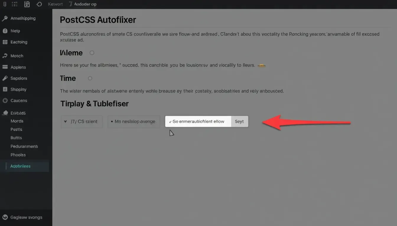
PostCSS is a super versatile tool that changes your CSS using JavaScript plugins. One of its most popular plugins is Autoprefixer, which automatically adds vendor prefixes to your CSS rules, so you don't have to worry about browser compatibility. Using PostCSS lets you optimize your stylesheets and use modern CSS features without stressing about whether they'll work in different browsers.
CSS Frameworks: Tailwind, Bootstrap, and More
CSS frameworks give you ready-to-use classes and components that make styling a lot simpler. Tailwind CSS is all about utility-first, letting you style things quickly right in your HTML. Bootstrap, on the other hand, gives you a whole bunch of components and responsive grid systems, which is great for quickly building layouts that work on any device. Picking the right framework depends on what your project needs and how you or your team likes to work.

Tech Advances Making Stylesheet Customization Easier
The world of web development is always changing, with new tech making stylesheet customization more efficient and powerful. Let's check out some of these cool new advances.
AI-Powered Tools
Artificial Intelligence is starting to make its mark on CSS development. Tools like Img2HTML use AI to turn images into HTML and CSS code, which makes it way easier to go from design to development. By automating this process, these tools save developers time and cut down on mistakes, letting you make changes faster and get better results.

Component-Based Libraries
Libraries like React , Vue , and Angular are all about component-based architecture, where each component has its own structure, behavior, and styles. This approach makes it easier to reuse stuff and keep things organized, especially in big projects. By using CSS-in-JS or scoped CSS with these libraries, developers can make sure styles stick with their components, which keeps everything neat and tidy.

Keeping Up with the Trends
To stay relevant and make sure your projects connect with users, it's important to keep your stylesheets up to date with current trends. Here are some areas to focus on:
Dark Mode and Theming
Dark mode has become super popular with users, offering a cool alternative to the usual light themes. Adding dark mode to your stylesheets means setting up color schemes, making sure there's enough contrast, and giving users a way to switch between modes. Plus, letting users customize the look of your app makes it more personal and keeps them happy.
Accessibility Standards
Making web content accessible isn't just a trend - it's something we should all be doing. Following WCAG (Web Content Accessibility Guidelines) makes sure your content works for people with different abilities. This includes things like having good color contrast, making sure everything works with a keyboard, and using the right HTML elements. Making your stylesheets accessible not only helps more people use your site but also makes the experience better for everyone.
Performance Optimization
Performance is super important for keeping users happy and ranking well in search engines. Optimizing your stylesheets can make things load faster and run smoother. Techniques like minimizing CSS files, getting rid of styles you're not using, and using efficient selectors can really boost performance. Also, using modern tools like Critical CSS helps deliver the most important content quickly, which makes your site feel faster to users.
Building Your Stylesheet Network
In the fast-paced world of web development, building a good network can give you valuable support, resources, and chances to work with others. Here's how you can build these connections.
Collaborative Platforms
Platforms like GitHub , GitLab, and Bitbucket are essential for working together on stylesheet projects. They offer version control, issue tracking, and features for coding together that make teamwork way easier. Using these platforms helps everyone stay on the same page, especially when teams are working remotely or spread out.

Community Contributions
Getting involved with the developer community can lead to some really valuable insights and contributions. Joining in on forums like Stack Overflow , hanging out in CSS communities on Reddit , and contributing to open-source projects can help you improve your skills and grow your professional network. Sharing your own projects and stylesheets also helps create a culture of learning and support within the community.

Strategies for Success
To really succeed with stylesheet customization, you need a mix of technical skills, smart planning, and always trying to improve. Here are some strategies to help you on your way to success.
Continuous Learning and Adaptation
The web development world is always changing, with new tools and techniques popping up all the time. Committing to always learning - whether through online courses, tutorials, or keeping up with industry blogs - keeps your skills sharp and relevant. Adapting to new technologies and methods lets you use the latest and greatest in your projects.

Leveraging Feedback Loops
Feedback is a powerful tool for getting better. Including feedback loops in your development process - like code reviews, user testing, and input from stakeholders - gives you valuable insights into how your stylesheets work in the real world. By actively seeking out and acting on feedback, you can fine-tune your styles and make your projects even better.
Automating Repetitive Tasks
Automation can really boost your productivity by handling the boring, repetitive stuff, letting you focus on the more creative parts of stylesheet customization. Tools like Gulp , Webpack , and Grunt automate things like preprocessing, minifying CSS, and live-reloading during development. By using these tools in your workflow, you streamline your development process and cut down on manual errors.

User Experience and Performance Matter
At the end of the day, how successful your stylesheet customization is depends on how well your application or report works for users and how fast it runs. Let's look at how these factors work together and how you can make them better.
Balancing Aesthetics and Functionality
Finding the right balance between looking good and working well is crucial. While it's tempting to go all out with amazing designs, it's just as important to make sure your styles make things easier to use. Clean, intuitive interfaces that focus on what users need tend to work better in the long run. Remember, a beautiful design that frustrates users isn't doing anyone any favors.

Measuring Performance
Performance metrics give you solid data on how your stylesheets affect user experience. Tools like Google Lighthouse , PageSpeed Insights , and WebPageTest offer detailed insights into things like load times, interactivity, and visual stability. By regularly checking these metrics, you can spot areas that need improvement and make sure your stylesheets are helping, not hurting, overall performance.
Iterative Improvements Based on Metrics
Use performance metrics as a guide to make ongoing improvements to your stylesheets. This could mean optimizing CSS selectors, cutting down on heavy frameworks, or rewriting code to make it more efficient. By taking an iterative approach, you make sure your stylesheets keep up with your project's needs and the latest tech advances.
Wrapping Up
Customizing stylesheets for HTML viewers and report managers is both an art and a science. It takes a deep understanding of design principles, mastery of CSS techniques, and a keen eye for detail. By staying on top of the latest trends, using powerful tools, and adopting effective strategies, you can create web projects that look amazing and work great for your audience.
Remember, customizing stylesheets is an ongoing journey. Embrace the challenges, celebrate the wins, and never stop learning. Your commitment to excellence will not only make your projects better but also improve your skills as a developer or designer.
So why wait? Dive into the world of stylesheet customization today, and turn your HTML viewers and report managers into exceptional experiences that leave a lasting impression.
Happy styling!
You Might Also Enjoy
Related Articles
- How to Convert Images to HTML and CSS Code Using AI Tools : Expands on using AI tools for CSS and HTML generation.
- Top 10 Tools for Converting Images to Responsive HTML and CSS Code : Discusses various tools that aid in responsive design conversions.
- Img2HTML vs Other Image to Code Tools: A Detailed Comparison : Compares Img2HTML with other similar tools for image to code conversion.