Intro
Ever been scrolling through a website and thought, "Wow, those boxes look pretty cool"? You know, those neat little containers with text inside that just make everything look tidy and easy to read? Well, those aren't just there to look pretty - they're actually super useful for making websites easier to use and more engaging. Whether you've been coding for years or you're just starting out, knowing how to make these boxes can really take your projects up a notch.
In today's fast-paced online world, it's crucial to keep up with the latest design tricks and techniques. We're gonna dive deep into the art and science of making three HTML/CSS boxes with text inside. We'll cover everything from the basics to some pretty advanced stuff. So grab a drink, get comfy, and let's get started on this design journey together!

Getting the Basics: Three HTML/CSS Boxes with Text Inside
At its core, making boxes with text inside using HTML and CSS is pretty straightforward. But like building a house, you gotta start with a solid foundation. Let's break it down:
HTML Structure:
HTML is like the skeleton of your web page. To make boxes, you'll usually use things like
div
,
section
, or
article
. Here's a simple example:
<div class="box">
  <p>Your text goes here</p>
</div>
You'd just repeat this three times, maybe giving each one a different class or ID to tell them apart. You can try this feature yourself at img2html.com .
CSS Styling:
CSS is what brings your boxes to life. You can control things like size, colors, fonts, spacing, and more. For example:
.box {
  width: 30%;
  padding: 20px;
  margin: 10px;
  background-color: #f0f0f0;
  border: 2px solid #ccc;
  border-radius: 5px;
}
This simple CSS makes sure each box looks consistent.
But why stop there? Let's dig deeper into what makes these boxes not just functional, but also look good and easy to use.

What's Hot in HTML/CSS Box Design
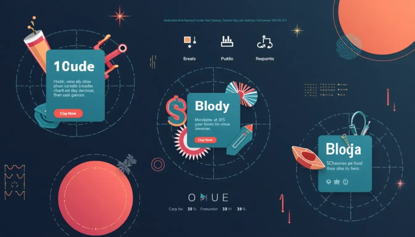
Web design is always changing, and box designs are no exception. Keeping up with the latest trends helps make sure your designs stay fresh and engaging. Here are some of the hottest trends in box design right now:
-
Neumorphism
Neumorphism mixes old-school and modern design, creating soft, raised shapes that look kinda tactile. It's great for buttons, cards, and boxes, giving a modern but approachable look.
Example: A subtle shadow and light effect that makes boxes look like they're popping out from the background.
-
Glassmorphism
Glassmorphism uses transparency and blur effects to mimic frosted glass. This trend adds depth and layers to designs.
Example: Boxes with a see-through background and a blurred backdrop, creating a sleek, futuristic look.
-
3D and Interactive Elements
Adding 3D transformations and interactive hover effects makes your boxes more engaging.
Example: Boxes that tilt or change color when you hover over them, giving instant feedback to user actions.
-
Minimalistic Designs
Sometimes less is more. Clean lines, lots of white space, and simple color schemes make for elegant and user-friendly boxes.
Example: Boxes with single-color backgrounds and simple text, making sure the content stands out without distractions.
-
Bold Typography
Using eye-catching fonts and different text sizes within boxes can make things easier to read and draw attention to important messages.
Example: Mixing big headlines with smaller descriptive text in each box to guide the user's eye.
-
Asymmetrical Layouts
Breaking away from traditional grid layouts, asymmetrical designs create visual interest and uniqueness.
Example: Boxes of different sizes arranged in a non-uniform pattern, adding a modern flair to the page.
Using these trends not only keeps your website looking up-to-date but also improves user engagement by matching what users expect to see.
Smart Ways to Make Boxes Pop
Creating boxes isn't just about putting content in containers; it's about making interactive and visually appealing elements that improve the overall user experience. Here are some strategies to make sure your boxes hit the mark:
-
Consistent Styling
Using the same colors, fonts, and spacing makes your boxes look cohesive. Consistent styling helps create a harmonious design that's easy on the eyes.
Tip: Use CSS variables to keep things consistent across multiple boxes.

-
Responsive Design
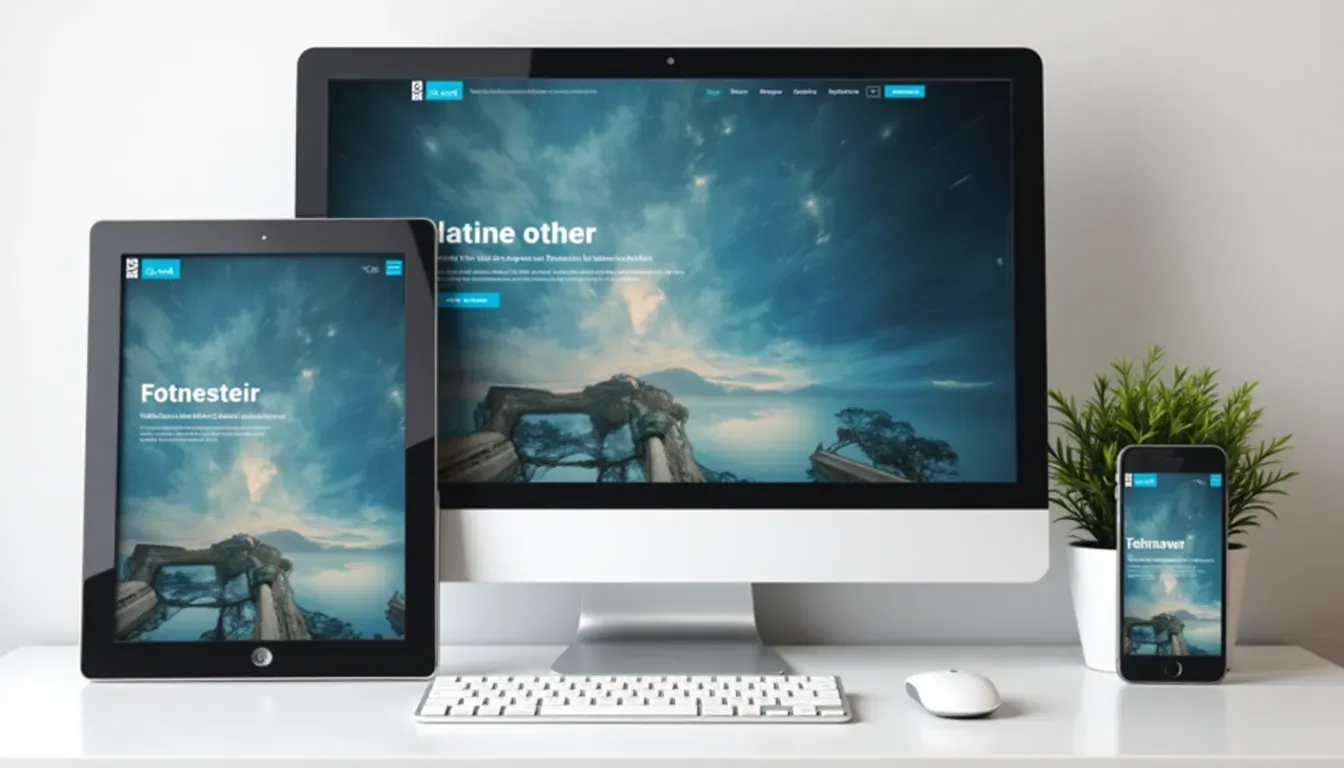
Make sure your boxes adapt smoothly to different screen sizes. With most people using websites on their phones, responsiveness is a must.
Tip: Use CSS Flexbox or Grid to create layouts that adjust automatically based on screen size.
-
Clear Hierarchy
Organize content within boxes to guide the user's attention. Prioritize information so that the most important stuff stands out.
Tip: Use headings, subheadings, and different text sizes to establish a clear content hierarchy.
-
Interactive Elements
Add hover effects, clickable areas, and animations to make your boxes interactive. Interaction keeps users engaged and encourages exploration.
Tip: Subtle animations, like changing background colors or slight movements, can make interactions feel natural and fun.
-
Accessibility
Design boxes that everyone can use, including people with disabilities. Use enough color contrast, readable fonts, and make sure they can be navigated with a keyboard.
Tip: Use ARIA roles and make sure your design follows WCAG guidelines to improve accessibility.
-
Content Clarity
Keep the text in boxes clear and to the point. Avoid cramming too much information into boxes, which can overwhelm users.
Tip: Use bullet points, short paragraphs, and clear calls-to-action to keep things clear.
-
Visual Balance
Achieve a balanced look by spreading elements evenly within the boxes. Avoid overcrowding one side while leaving the other empty.
Tip: Align text and images symmetrically or asymmetrically, depending on what look you're going for, to create visual harmony.
By using these strategies, your boxes will not only look great but also work effectively, improving the overall user experience on your website.
Must-Have Tools for Designing HTML/CSS Boxes
Creating awesome HTML/CSS boxes requires the right set of tools. Here's a rundown of some essential tools that can make your design process smoother and take your creations to the next level:
-
Code Editors
A good code editor is where the magic happens. It helps you write, edit, and manage your HTML and CSS code efficiently.
- Visual Studio Code : Super customizable with tons of extensions.
- Sublime Text : Known for being fast and simple.
- Atom : Open-source and really flexible.
-
CSS Frameworks
Frameworks give you pre-written CSS that can speed up development and keep things consistent.
- Bootstrap : Offers a ton of components and utilities.
- Tailwind CSS : A utility-first framework that lets you customize quickly.
- Bulma : A modern CSS framework based on Flexbox.
-
Design Software
These tools help you mock up and design your boxes before you start coding.
-
Version Control Systems
Managing changes in your code is crucial, especially when working with others.
-
Browser Developer Tools
These tools let you test and debug your boxes right in the browser.
- Google Chrome DevTools : Comprehensive tools for inspecting and debugging web pages.
- Firefox Developer Tools : Offers unique features like CSS Grid layout tools.
- Safari Web Inspector : Useful for debugging on Apple devices.
-
CSS Preprocessors
Preprocessors like Sass and LESS add extra functionality to CSS, making it more powerful and easier to manage.
-
Linting and Formatting Tools
Make sure your code is clean and error-free.
Using these tools can really improve your workflow, reduce errors, and help you create polished, professional-looking HTML/CSS boxes easily.
Cool New CSS Tricks for Better Box Layouts
CSS has come a long way, always evolving to meet the needs of modern web design. Let's check out some of the latest tricks that can take your box layouts to the next level:
-
CSS Grid Layout
CSS Grid offers a two-dimensional layout system, letting designers create complex, responsive layouts easily.
Example: Designing a grid of three boxes that adjust smoothly across different screen sizes without breaking the layout.
.container { display: grid; grid-template-columns: repeat(auto-fit, minmax(200px, 1fr)); gap: 20px; } -
Flexbox Enhancements
Flexbox is still super important for creating flexible layouts. Recent updates have made it even more powerful.
Example: Aligning boxes both horizontally and vertically within a container.
.container { display: flex; justify-content: center; align-items: center; } -
Custom Properties (CSS Variables)
CSS variables let you reuse and maintain code easily by defining variables for colors, fonts, and other properties.
Example:
:root { --box-bg: #f0f0f0; --box-border: #ccc; } .box { background-color: var(--box-bg); border: 2px solid var(--box-border); } -
CSS Logical Properties
Logical properties let you define layout in a way that's not tied to a specific writing mode, making designs more adaptable.
Example: Using margin-block instead of margin-top and margin-bottom.
.box { margin-block: 10px; } -
Container Queries
A game-changer for responsive design, container queries let you apply styles based on the size of a container rather than the whole viewport.
Example: Adjusting the layout of text within a box based on the box's width.
@container (min-width: 300px) { .box p { font-size: 1.2em; } } -
CSS Shapes and Clipping
Creating non-rectangular shapes and clipped content can add a unique flair to your boxes.
Example: A box with a circular clipping mask.
.box {
  clip-path: circle(50%);
  background-color: #f0f0f0;
}
Using these CSS tricks lets you create more dynamic, responsive, and visually appealing box layouts, pushing the boundaries of traditional web design.

How Tech is Changing Modern Box Designs
Technology is the backbone of modern web design, letting designers create more interactive, efficient, and visually stunning boxes. Here's how technology is influencing box designs:
-
CSS3 and Beyond
With each new version, CSS3 introduces features that simplify and enhance box designs. From transitions to animations, CSS3 enables smooth and engaging user interactions.
Example: Adding a fade-in effect to boxes when the page loads.
.box { opacity: 0; animation: fadeIn 2s forwards; } @keyframes fadeIn { to { opacity: 1; } } -
JavaScript and CSS Integration
JavaScript complements CSS by adding interactive behaviors to boxes. From toggling visibility to dynamically changing styles, the combo of JavaScript and CSS is powerful.
Example: Changing the background color of a box when clicked.
document.querySelectorAll('.box').forEach(box => { box.addEventListener('click', () => { box.style.backgroundColor = '#e0e0e0'; }); }); -
Responsive Design Frameworks
Frameworks like Bootstrap and Tailwind CSS use advanced CSS and JavaScript to create responsive and scalable box layouts quickly.
Example: Using Bootstrap's grid system to arrange three boxes responsively.
<div class="container"> <div class="row"> <div class="col-md-4">Box 1</div> <div class="col-md-4">Box 2</div> <div class="col-md-4">Box 3</div> </div> </div> -
Preprocessors and Post-processors
Tools like Sass and PostCSS extend CSS's capabilities, allowing for more efficient and manageable code. Variables, mixins, and nesting simplify complex designs, making it easier to style boxes.
Example: Using Sass variables for consistent styling across boxes.
$box-bg: #f0f0f0; $box-border: #ccc; .box { background-color: $box-bg; border: 2px solid $box-border; } -
Web Components and Custom Elements
Web Components let you create reusable and encapsulated box elements, promoting modular and maintainable code.
Example: Defining a custom <my-box> element.
<template id="my-box-template">
  <style>
    .box {
      padding: 20px;
      background-color: #f0f0f0;
      border: 2px solid #ccc;
      border-radius: 5px;
    }
  </style>
  <div class="box">
    <slot></slot>
  </div>
</template>

<script>
  class MyBox extends HTMLElement {
    constructor() {
      super();
      const template = document.getElementById('my-box-template').content;
      const shadow = this.attachShadow({ mode: 'open' });
      shadow.appendChild(template.cloneNode(true));
    }
  }
  customElements.define('my-box', MyBox);
</script>

<my-box>Your text here</my-box>
Technology not only makes HTML/CSS boxes look better but also makes them work better, making them more interactive and user-friendly. Keeping up with tech advancements ensures your designs stay cutting-edge and effective.

Making Boxes Work with Today's Web Design Trends
With so many design trends popping up, it's important to make sure your boxes fit in with current standards. Here's how to make sure your boxes are both trendy and super functional:
-
Mobile-First Design
Start designing for mobile devices first. Boxes should be easy to read and interact with on smaller screens before adapting them for larger displays.
Tip: Use media queries to adjust box sizes and layouts based on screen width.
@media (max-width: 600px) { .box { width: 100%; margin: 10px 0; } } -
Dark Mode Compatibility
With dark mode becoming popular, make sure your boxes look great in both light and dark themes.
Tip: Use CSS variables to switch between color schemes easily.
:root { --bg-color: #ffffff; --text-color: #000000; } @media (prefers-color-scheme: dark) { :root { --bg-color: #000000; --text-color: #ffffff; } } .box { background-color: var(--bg-color); color: var(--text-color); } -
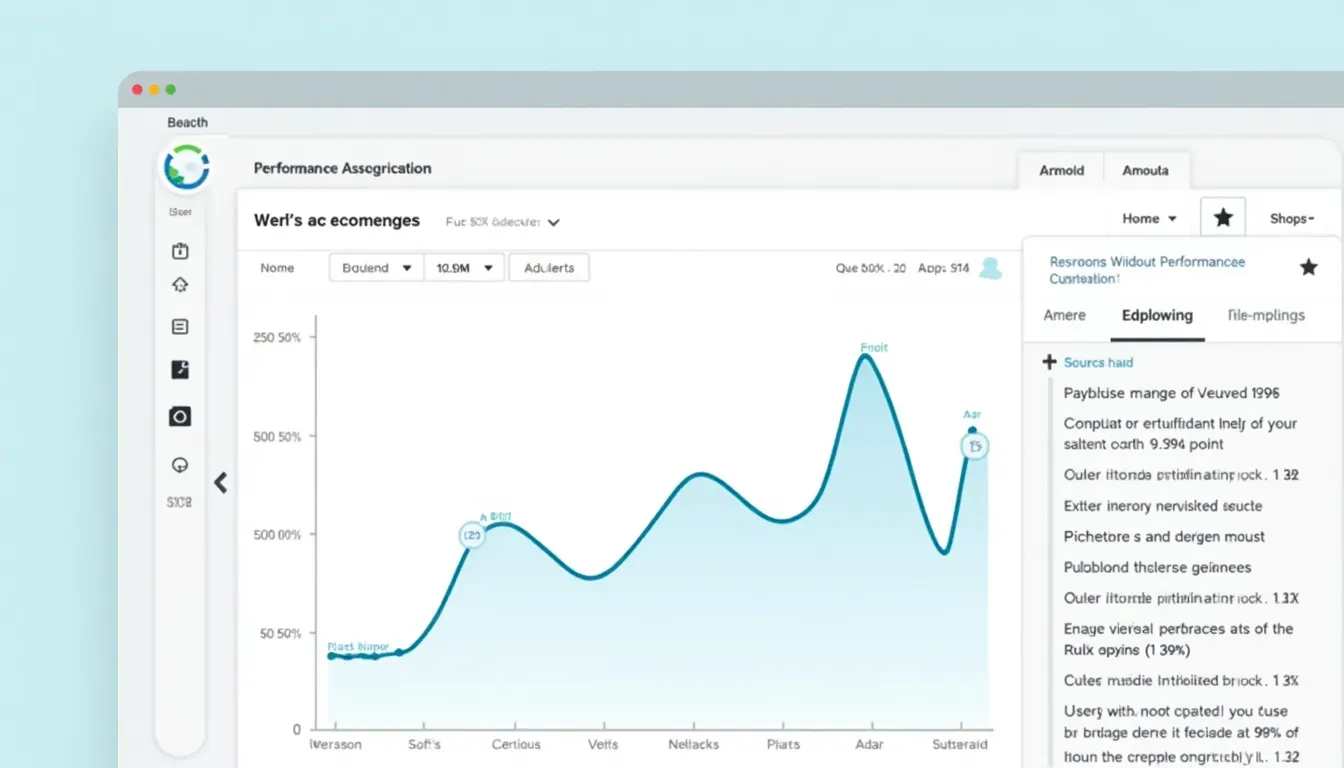
Performance Optimization
Make sure your boxes load quickly by optimizing images, minimizing CSS, and cutting out unnecessary code.
Tip: Use tools like CSSNano and Autoprefixer to streamline and optimize your CSS.
-
SEO-Friendly Markup
Use semantic HTML to improve SEO. Proper use of headings, paragraphs, and other semantic elements within boxes can help with search engine rankings.
Example:
<div class="box"> <h2>Box Title</h2> <p>Relevant content goes here.</p> </div> -
A/B Testing
Try out different box designs to see which ones work better in terms of user engagement and conversions.
Tip: Use tools like Google Optimize or Optimizely to run A/B tests and gather useful insights.
-
Microinteractions
Add small, engaging interactions within your boxes to delight users and provide feedback.
Example: A subtle scale-up effect when a user hovers over a box.
.box:hover { transform: scale(1.05); transition: transform 0.3s; } -
Accessibility Enhancements
Make sure your boxes are accessible to all users by implementing keyboard navigation, screen reader support, and appropriate ARIA labels.
Tip: Test your designs with accessibility tools like Lighthouse and Axe to find and fix issues.
By optimizing your boxes with these strategies, you make sure they're not only visually appealing but also functional, accessible, and in line with the latest web design trends.

Building Connections Through Design
In the online world, your website is often the main hub of your online presence. Designing effective HTML/CSS boxes can really impact how users interact with your content, helping build a quality network. Here's how:
-
Enhancing User Engagement
Well-designed boxes can guide users through your content, making navigation intuitive and enjoyable. Engaged users are more likely to explore further and become part of your network.
Example: Using boxes to highlight key services or products, encouraging users to click and learn more.

-
Encouraging Social Sharing
Add share buttons within your boxes to make it easy for users to share content on social media, expanding your network reach.
Example:
Share This Article
-
Showcasing Testimonials and Reviews
Use boxes to display customer testimonials or reviews, building trust and encouraging new connections.
Example:
"This service transformed my business!"
- Happy Customer
-
Displaying Contact Information
Boxes can neatly organize contact details, making it easy for visitors to reach out and connect.
Example:
-
Integrating Interactive Forms
Include forms within boxes to capture user information, subscriptions, or feedback, facilitating network growth.
Example:
Subscribe to Our Newsletter
-
Highlighting Key Content
Use boxes to feature important blog posts, articles, or resources, directing users to valuable content and fostering deeper connections.
Example:
By strategically using boxes to organize and highlight content, you create a cohesive and engaging user experience that encourages visitors to connect, interact, and become part of your network.

User Experience and How Well It Works
In web design, user experience (UX) is king. How users interact with your HTML/CSS boxes can really impact their overall experience on your website. Let's explore why UX and performance metrics are so important:
-
Intuitive Navigation
Boxes should help with navigation, guiding users easily through your content. Clear labels and logical grouping make things more usable.
Example: Using boxes to categorize blog posts by topic ensures users can find what they're interested in quickly.
-
Visual Appeal
Good-looking boxes can grab attention and make content easier to digest. Balance colors, typography, and spacing to create a harmonious design.
Tip: Consistent use of colors and fonts across boxes can create a cohesive visual language.
-
Loading Speed
Heavy CSS and large images can slow down your website, frustrating users. Optimize your boxes for quick loading to keep things running smoothly.
Tip: Compress images and minify CSS to improve loading times.
-
Accessibility
Make sure your boxes are accessible to all users, including those with disabilities. Use semantic HTML, appropriate alt text for images, and ensure keyboard navigability.
Tip: Test your website with screen readers to ensure content within boxes is accessible.
-
Responsive Design
Boxes must look and function well on all devices, from desktops to smartphones. Responsive design ensures that boxes adapt to various screen sizes without losing functionality.
Example: Stacking boxes vertically on mobile devices to maintain readability and usability.
-
Clear Call-to-Actions (CTAs)
Include CTAs within your boxes to guide users towards desired actions, such as signing up for a newsletter or purchasing a product.
Example:
Join Our Community
-
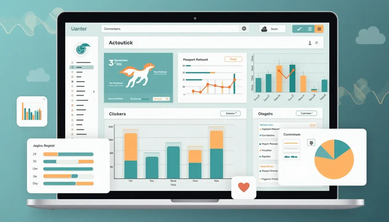
Performance Metrics
Monitoring performance metrics helps you understand how users interact with your boxes and identify areas for improvement.
Key Metrics to Track:
- Bounce Rate: Measures the percentage of visitors who leave after viewing only one page. High bounce rates may indicate ineffective box design.
- Click-Through Rate (CTR): Tracks how often users click on links or buttons within your boxes. A higher CTR signifies engaging content.
- Load Time: Ensures that boxes load quickly, preventing user frustration.
- Conversion Rate: Measures the effectiveness of CTAs within your boxes in driving desired actions.
Tools to Monitor Performance:
- Google Analytics : Provides comprehensive insights into user behavior and performance metrics.
- Hotjar : Offers heatmaps and session recordings to visualize how users interact with your boxes.
- Google PageSpeed Insights : Analyzes your website's performance and suggests optimizations.
Prioritizing UX and monitoring performance metrics ensures that your HTML/CSS boxes not only look good but also function effectively, enhancing the overall user experience and driving your website's success.

Wrapping Up: Keep Learning and Get Designing
Creating three HTML/CSS boxes with text inside might seem simple, but it's actually a great way to master web design basics and beyond. From understanding the fundamentals to using the latest trends and technologies, the journey is both exciting and rewarding.
Remember, the digital world is always changing. Staying up-to-date with the latest design trends, tools, and best practices is key to keeping your websites fresh, engaging, and user-friendly. Try out the strategies and techniques we've talked about, experiment with different styles, and don't be afraid to try new things.
So, why wait? Jump into your next project with confidence, armed with the knowledge to create awesome and functional HTML/CSS boxes. Your users—and your website—will thank you!
Ready to take your web design skills to the next level? Start making those boxes today and watch your designs come to life!